Workflow Basics
Photoshop 101
Start as you mean to go by adopting a robust, non-destructive workflow.


Day 2: Workflow Basics
Welcome to Day 2 of Photoshop 101! Yesterday we set up our copy of Photoshop, made the interface a little friendlier, and had a look around at what everything does. Today, we’re going to learn about how to use those tools in a robust, “non-destructive” workflow, and also set ourselves up a column-based layout grid using shapes.
Day 2 learning objectives:
- Learn what a non-destructive workflow is
- Establish a robust workflow in Photoshop
- Create a column grid using shapes
- Cover grouping and locking layers
Time to complete: 30 minutes
What is a non-destructive workflow?
Working non-destructively simply means that, when we’re working on a document, we should aim (within reason) to make every action reversible further down the line.
This approach has a number of benefits. For example, it allows us to:
- Easily create and compare variations of the same design
- Undo an edit or adjustment that we change our minds about
- Hand over work in a way that allows someone else to understand our process
In Photoshop, we achieve a non-destructive workflow by:
- Making our edits on separate layers where possible
- Keeping layers scalable by using vector-based shapes and smart objects
- Saving out a new version of the file after each significant change
Don’t worry if those points aren’t quite clear yet—we’ll be returning to workflow principles throughout the course. For now, let’s press on and learn about how we can start to build this workflow using layers.
How Photoshop uses layers
Photoshop naturally organizes objects in a document into layers. We’ll commonly encounter five different types of layer in Photoshop:
- Raster layer, which is formed of pixels (e.g. a photo). This is also known as an Image layer.
- Shape layer, which is formed of vectors (e.g. a “live shape” like a rectangle or ellipse).
- Adjustment layer, which applies an adjustment (like brightness or contrast) to the layers underneath it in the Layers list.
- Fill layer, which always consists of a single solid block of color.
- Type layer, which contains editable text.
Conceptually, layers sit “above” or “below” one another in a stack, as represented by the list shown in the Layers panel on the right of the Photoshop interface we set up yesterday.
Layers are stacked in the same way that we might pile up sheets of paper on a desk. Alternatively, think of a Photoshop file as working like a collage: every element in a collage must be on top of or underneath another element, though some of those elements might be transparent or semi-transparent.
Today’s tutorial: creating a layout grid using shape layers
In order to start exploring how layers work, let’s create some shapes. These shapes are going to form a column-based layout grid to help us with our landing page design.
Before we get started, we just need to change one more setting: make sure that Smart Guides are turned on. You can find this setting by going to the View menu at the top of your screen, then the Show submenu, and clicking Smart Guides. Turning Smart Guides on means that Photoshop will help us align objects to one another.
1. Create a new document.
Make it 1200 x 800 pixels, just like yesterday. Hit [[⌘]] [[Shift ⇧]] [[S]] to save the document, giving it a name like “Landing Page.psd”. If you see a dialog box called “Maximize Compatibility”, just click OK (and—even better—also click “Don’t show again”.) For reference, “PSD” is the file extension for Photoshop files. We’ll explain more about file types towards the end of the week.
2. Practice zooming.
I don’t know about you, but on my screen the document is looking pretty zoomed out. Hit [[⌘]] [[0]] (zero) to fit the canvas size to the window. You can press [[⌘]] [[1]] to get back to actual size, and use [[⌘]] [[+]] and [[⌘]] [[–]] to zoom in and out in steps.
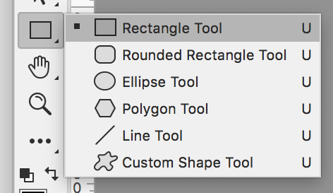
3. Select the Rectangle Tool.
This lives in the Tools panel on the left. (Check the Tools panel cheat sheet from yesterday if you can’t find it.) One thing we didn’t mention yesterday is that any button with that tiny arrow in the bottom-right corner is actually a set of tools; you can select which you want to use by clicking and holding on the icon in the Tools panel. This is important to note, because if you recently used a different tool in the set, like the Ellipse tool, it means that the icon will appear differently. Also, note that the same keyboard shortcut applies to all of the tools within a set—Photoshop will select whichever one you used last.
4. Draw a rectangle.
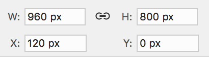
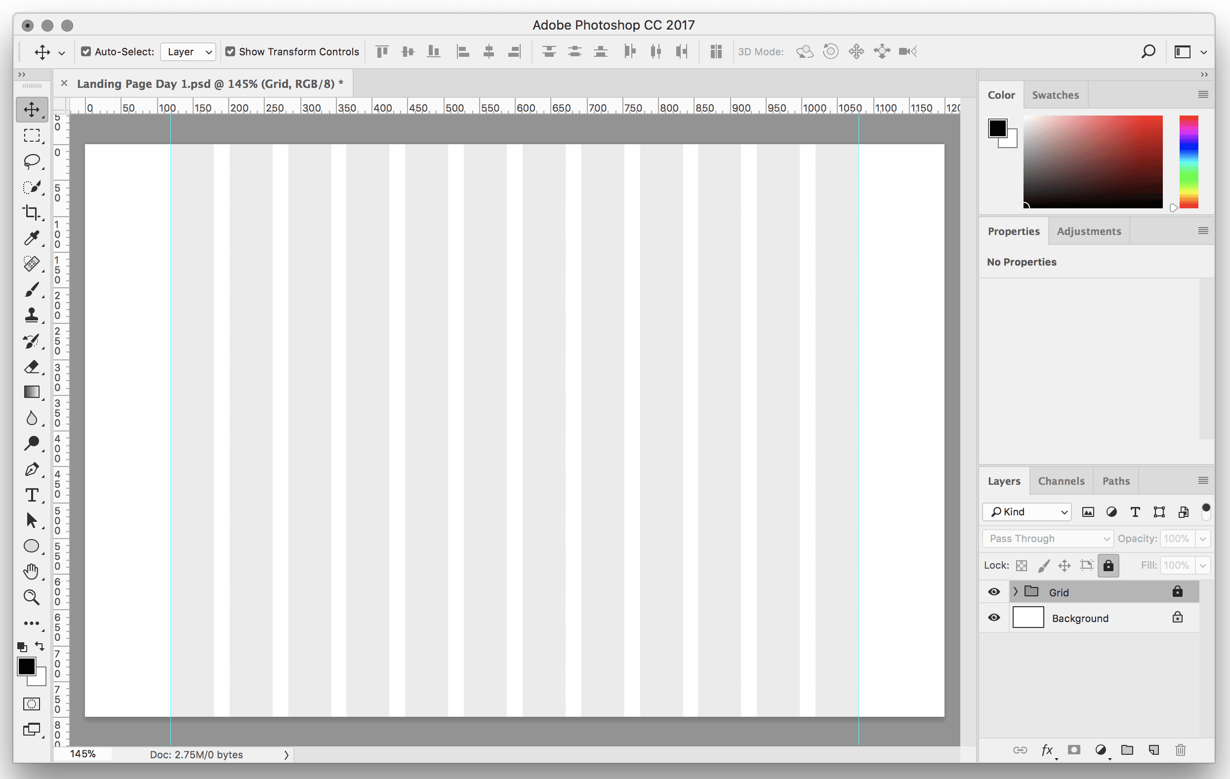
Next, we want to click and drag within our image to draw a rectangle that is 960 pixels wide and 800 pixels high. The size doesn’t need to be exactly correct when you first create the shape, because we can always use the Properties panel over on the right to set the precise values that we need.
Once you’ve created the rectangle, set the following values in the Properties panel. W and H set the size of the object, and X and Y set the position of the object in the document.
5. Set fill and stroke for the rectangle.
Just underneath those settings, you can also change the fill and stroke colors for the selected object. Change the fill color on the left to a light gray, and make sure that there’s no stroke set. When there’s no stroke set, the box has a line through it, just like this:
6. Create some guides.
The rectangle we’ve created shows the left and right edges of the layout grid we’re about to make. Before we do that, let’s create some vertical guides to line up with the left and right edges of this shape. To do this, click within the vertical ruler on the left of the window, and drag in towards the center of the document. If your rulers aren’t showing, hit [[⌘]] [[R]] to toggle them on.
Repeat this step to create a guide at each edge of the rectangle (these will be at 120px and 1080px). If you prefer, a more accurate way to set guides is to go to the View menu, and click New Guide. Once you’ve created a guide, you can return to the Move tool (keyboard shortcut [[V]]), then click and drag on the guides to reposition them.
7. Create the first column of the layout grid.
In web design, using a column-based layout grid is very important, because it allows us to vertically align different elements and create order and hierarchy within a layout. Photoshop doesn’t have a layout grid function built-in, but we can easily create a grid using rectangle shapes. Click on the rectangle we created, and in the Properties panel, change the width from 960px to 60px. It’ll look like this:
Remember, if you ever lose the Properties panel, or any other panel, you can always head up to the Window menu and re-select it from the list to bring it back.
8. Create all 12 columns of the layout grid.
Next, we’ll duplicate this column eleven (yes, 11) times. We’ll then have 12 rectangles to form our 12-column layout grid. Make sure that the rectangle is selected, then hit [[⌘]] [[J]] to duplicate it, until you have 12 rectangles showing up in the layers list on the right (you’ll need to stop duplicating when you get as far as “copy 11” of the rectangle).
Hurrah! But at the moment, all of those rectangles are sat on top of each other, in the same position. To fix this, click that topmost rectangle (it’ll be “copy 11”) and drag it across so that the right hand edge is lined up to the guide we created. Once you’ve done that, check the position in the Properties panel: it should be at X: 1020 px, Y: 0 px.
9. Use the distribute function to position the other columns.
Don’t worry—we don’t need to move every rectangle manually. Photoshop has a distribute function built in, which will allow us to automatically spread these shapes out. To do this, keep “copy 11” selected, hold down [[Shift ⇧]] (and keep it held down), then scroll down to the bottom of the Layers panel and click on the first rectangle.
Notice that all of the intervening layers in the panel are now selected as well (that’s because we held down [[Shift ⇧]]). Finally, head to the Options panel at the top of the screen (the horizontal toolbar above your document), and click the “Distribute left edges” button. This should give us a nice, evenly spaced out 12 column grid.
We’re nearly finished—there’s just one final step.
10. Group and lock the layout grid.
Finally, we need to group those layers that we still have selected, by pressing [[⌘]] [[G]], then rename the group by going to the Layer menu, and selecting Rename Group. Change the group’s name to “Grid”, and finally finally, hit [[⌘]] [[/]] (forward slash) to lock the group. Locking the group means that we’ll be able to place other objects on top of it without accidentally moving our grid around.
Here’s how the grid should be looking:
That’s Day 2!
We now have a layout grid that we can design our landing page on top of, and by creating it we’ve learned about shapes, layers, properties, distribution, grouping, and layer locking. Nice work!
If you’ve not yet saved your file, make sure to save it as “Landing Page Day 1.psd”, and hit [[⌘]] [[W]] to close the document. See you tomorrow!
* Bonus: Set of PSD files ready made with different column grids

Create A Landing Page
Design the first screen of a landing page using shapes and the Type tool.