Create A Landing Page
Photoshop 101
Design the first screen of a landing page using shapes and the Type tool.


Day 3: Create a Landing Page
You’ve made it to Day 3 of Photoshop 101! It might have felt like slow going up to now, but we’ve been covering some really important basics that will make it easier for you to work quickly and creatively further down the line.
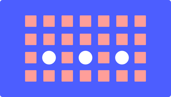
Today, we’re going to start building over the layout grid we made yesterday, to create the first screen of our landing page design. Here’s what we’re aiming to create today:

In web and user interface (UI) design, this is an example of what’s called a high-fidelity wireframe. That refers to a design that is low in detail, but in which the elements are accurately positioned and laid out. Essentially, it is a skeleton design that we can populate with more text and images when we’re ready.
Day 3 learning objectives:
- Use the Type tool, Character and Paragraph palettes
- Learn the Align functions
- Experiment with the color picker
- Position elements relative to the layout grid
- Consolidate yesterday’s learning about shapes, layers, and distribution function
Time to complete: 45 minutes
Let’s get started! Open up your document from yesterday. The first thing to do is to hit Save As ([[⌘]] [[Shift ⇧]] [[S]]), and save a new file: “Landing Page Day 2.psd”. Remember, by regularly saving different versions as we go along, we can easily go back to an earlier stage of the project if we want to.
1. Create the big rectangle.
First, let’s block out those main shapes, shown above in gray. Eventually, we’ll fill those shapes with photography by using them as image masks, but for now we’ll leave them as live shapes. Go ahead and draw the big rectangle—note how it spans the whole document, going beyond the edges of the grid. Remember, you can access that Rectangle tool by clicking in the Tools panel or by just pressing the [[U]] key. Once you’ve created the shape, change the color to a light gray.
2. Add the circles.
To create the circles, we actually need to use the same tool. This time, click and hold the Rectangle icon in the Tools panel, and select Ellipse from the menu that pops up. Drag to create a circle that roughly spans one column and the “gutter” (the space between columns) on each side. Once you’re happy with that shape, hit [[⌘]] [[J]] three times to duplicate the circle.
Just like we did when creating the column grid, drag the last circle over to its position on the right, then select all 4 circles, and use the “distribute left edges” button in the Options panel to distribute them evenly. We can also make sure that they’re aligned to one another horizontally using the “align top edges” button, which you can find just along from the distribute commands.
3. Create the first text element.
Hit [[T]] to access the Type tool, and click anywhere to create a text layer. Note that the Options panel at the top of the screen is now giving us options for our text layer. Let’s keep things simple, and choose Arial for all our text on this page. For this first element, let’s also choose Bold and set the size to 32px.
Let’s start by typing the name of the page—we’ve chosen “landing”, but you can probably come up with something more imaginative. To commit the text you’ve entered, you just need to click outside the text box. Press [[V]] to select the Move tool—this will allow us to position the text layer where we want it, up in the top left of the grid.
4. Repeat this process for all the other text elements except the button.
Adjust the font size and text color from the Options panel as you go. For reference, we used 32px text size for the wordmark (“landing”), 16px text size for the menu items and button copy, 40px text size for the headline text, and 24px for everything else. Aim to get everything positioned in a similar way to the screenshot above. You can also download this sample file so that you can take a look at how we positioned things.
Here are some tips that might be useful:
- Remember that you need to commit edits to your Type layer by clicking outside the layer, then hit [[V]] to select the Move tool and re-position each layer.
- Those distribute and align commands could come in handy! (Look in the Options panel while you have the Move tool selected.)
- You can edit existing Type layers by selecting the Type tool ([[T]]) and clicking within the text you want to edit.
- Resizing text layers can be a bit annoying. If you try to resize a text layer using the Move tool ([[V]]), you’ll probably end up stretching the text like this:
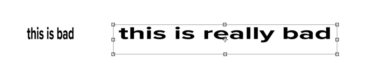
- What we want to do instead is to use the Type tool (hit [[T]] again to select it), then click on the text you want to resize. You’ll then see some subtly different resizing handles. Click and drag on these to resize the text box without distorting the text.
Your screen should be looking something like this now:

5. Create the button elements.
Although it looks pretty cool, it’s just a filled rectangle like we’ve created several times already, with some white text over the top of it. Here are the steps to follow:
- Select the Type tool ([[T]]) and click roughly where you want the button to go.
- Type out your button copy (“Take the tour”) and adjust the size (16px) and color (white). Feel free to experiment with other text settings too!
- Select the Rectangle tool ([[U]]) and draw the basic button shape in the same place as the text. It’ll need to be about 3 columns wide.
- Change the color of the rectangle to something attention-grabbing.
6. Change the layer order of the button elements.
Currently we have a problem: our rectangle is sat *on top* of the button text, which means it’s obscuring it. You’ll be able to see in the Layers list that the rectangle we’ve just created is above the text layer we’re talking about. To fix this, we can either drag the layer down in the Layers list, or use a handy keyboard shortcut [[⌘]] [[[]] to send the object backwards. You might need to hit [[[]] several times until the rectangle slots in behind the text. If you need to bring an object forwards again, the keyboard shortcut (you guessed it) is [[⌘]] [[]]].
7. Create the button’s rounded corners.
Make sure you’ve still got that rectangle selected. In the Properties panel, you’ll see some slightly unfriendly looking text:
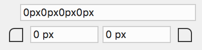
The reason that “0px” is repeated 4 times is that it refers to the 4 corners of the rectangle (top-left, top-right, bottom-right, bottom-left). Click in this box and type 16px (just once). Photoshop will apply the 16px rounding effect to all 4 corners:
8. Align the button elements.
Now, let’s make sure the button text is centered relative to the button background. To do this, hold down [[Shift ⇧]], then click the button background once, followed by the button text once. This has selected both objects, allowing us to use the align tools again in the Options panel. Hit “Align vertical centers” and then “Align horizontal centers”. If the button still doesn’t look right, use the Type tool to reduce the size of the button text layer.
9. Group the button elements and rename the group.
Again with the both the button background and the button text selected, hit [[⌘]] [[G]] to group them. Rename the group “Button” (remember, that option is up in the “Layer” menu).
10. Check alignment and finish.
Last thing to do today is to go around your page checking alignment, using the screenshot below as a reference point. Ask yourself questions like:
- Are all my elements aligned to the grid?
- Are groups of objects correctly aligned to one another?
- Are text labels consistently aligned to the objects they belong with?
Remember you can always select the Move tool ([[V]]) and use those alignment and distribution buttons to fix things. You can also take this opportunity to tweak the color and position of your design elements!
Day 3 is done!
Tomorrow is the half-way point of Photoshop 101, and we’re going to take a break from all this shape and text alignment. Instead, we’ll work on some bona fide Photoshopping—editing and enhancing photos. Exciting! See you then.
* Bonus: Sample landing screen PSDs at different resolutions (mobile, 960, 1280)

Photo Editing and Enhancement
Create your landing page hero image by editing and enhancing a photo.