Confused by talk of “design sprints”, “prototyping”, “high fidelity”, “low fidelity”, and everything in between?
This is the piece for you! Designlab mentor Sangeeta Balasubramani explains what these terms mean—and what she’s learned about prototyping in her own UX design work.
What are sprints and prototypes?
If you’re taking your first steps in the world of UX design, chances are that the terms sprint and prototype are still a bit of a mystery. So before we go any further, let’s take a look at some definitions.
A sprint is a method for quickly developing a product. It has roots in software development, but the use of “design sprints” has become common, especially since the publication of Sprint by Jake Knapp et al of Google Ventures.
In essence, a sprint is a set period of time (typically one or two weeks) during which specific work has to be completed and prepared for review. Sprints are often used by startups and other companies that embrace a “fail fast” attitude—particularly within design and engineering teams.
A prototype is a rough version of a product that can be made quickly. Nielsen Norman Group describes a prototype as “a hypothesis—a candidate design solution that you consider for a specific design problem.”
By testing prototypes, UX designers can observe the design solution in use, and get direct feedback from users. In turn, this allows the design to be revised and improved.

How are sprints and prototypes related?
If you are a UX designer working for a startup, you probably work closely with a product manager (PM).
PMs are responsible for the strategy, roadmap, and feature definition of a product. They tend to work very closely with designers and engineers, and are responsible for the timely release of product updates and new features.
In this kind of environment, we are often surrounded by time constraints, yet also have to ship high-quality features. As a result, it can become difficult to follow a nice linear design “process”.
This is where the design sprint comes in.
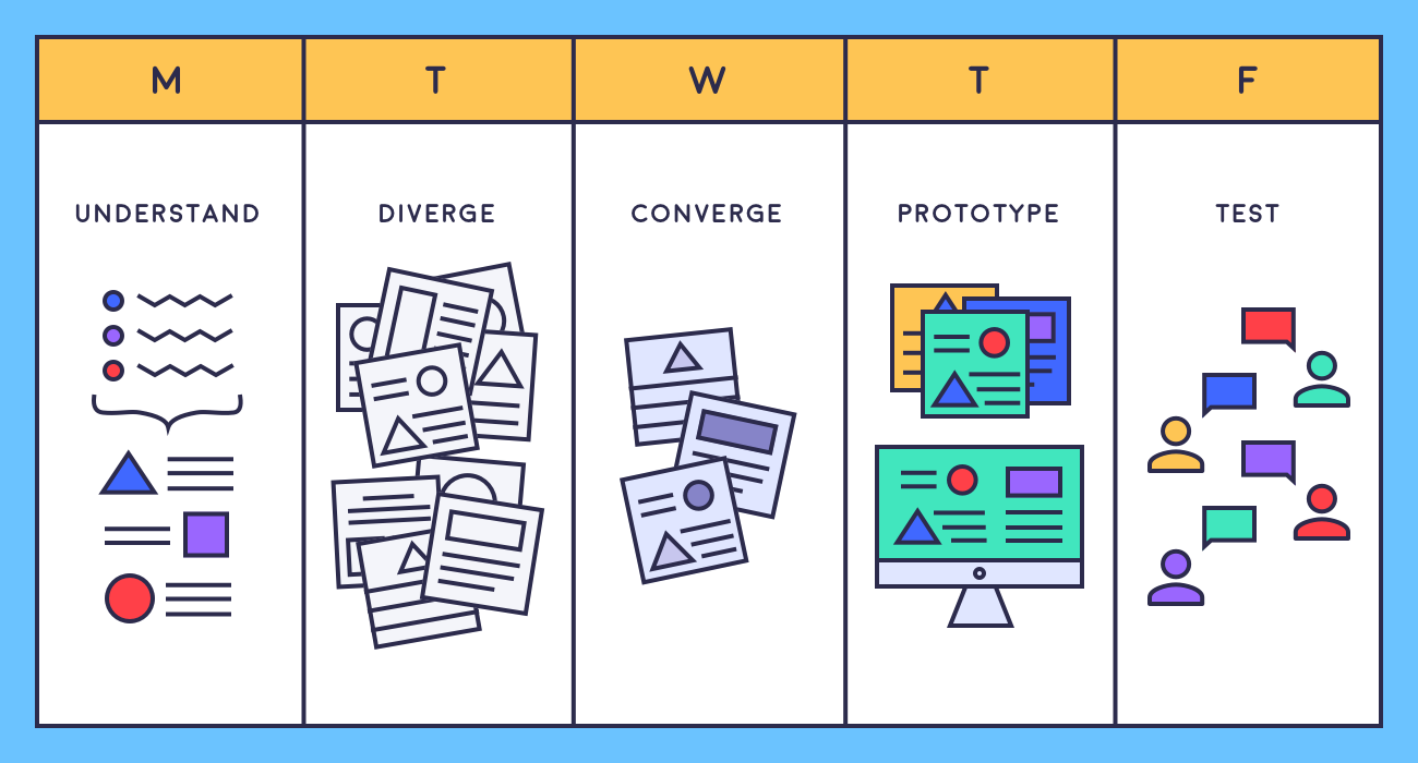
A design sprint is a time-constrained exercise that involves five distinct stages: Understand, Diverge, Converge, Prototype and Test. At the end of the sprint, a team will have tested several prototypes with users, and clarified a way forward for the product.
Why should you prototype?
Prototyping allows you to detect problems
One of the biggest benefits of prototyping is that the return on investment tends to be high. It is also one of the most effective ways to gather feedback, validate hypotheses, and discover pain points for users.
Prototyping helps designers explore potential solutions
Prototyping allows you to explore all your ideas, get feedback on them, and establish which ones are worth taking forward and developing further in the next round of iterations.
Prototyping is rapid
Prototyping is most beneficial when it’s done rapidly. No matter what the shape, format, or fidelity of your prototypes, they have the power to yield proof of concept.
Prototypes can engage the wider team
I have often worked with sales and marketing teams within the company to create prototypes for features that are still being built by the engineering teams. High fidelity prototypes have the power not only to generate interest amongst existing and prospective customers, but also to create a compelling vision of the product.
High-fidelity prototypes can be used to test demand
If a product is yet to enter the market, high-fidelity prototypes can allow a team to validate user demand for the product direction before committing full-on development resources.
Prototypes can inspire
As UX designers, we are in a unique position to inspire people both within and beyond our team, and get them excited about the company’s product and future possibilities.
Different kinds of prototype
There are several different kinds of prototype that you can create, ranging from static sketches to interactive experiences. Before deciding on the format of a prototype, always ask the following questions:
- What is the overall goal of the exercise?
- What questions do you need to answer?
- How much time do you have?
Once you’ve answered those points, these are the parameters to consider when deciding what kind of prototype is feasible for your project:

- Fidelity: This is defined by how rough or polished you would like the prototype to be. Prototypes can be low-fidelity, medium-fidelity, or high-fidelity.
- Medium: In the case of an app interface, low fidelity might mean sketches on paper; medium fidelity could be wireframes in a prototyping tool like InVision; and high fidelity will be something close to the final visuals, and might even be coded up to resemble the final functionality.
- Interactivity: Higher fidelity generally means more interactivity. In a low fidelity prototype, the user might be restricted to just clicking through screens in sequence. Using a high-fidelity prototyping tool like Framer, it’s possible to build a fully interactive prototype.
- Design phase: If you’re at the beginning of a project and just looking to validate a possible direction, simple wireframes will probably be a good choice. At the end of a project, you’ll be testing details, so offering realistic functionality is likely to be more important.
Unconventional approaches, unexpected lessons: 4 top tips
In a recent project, I decided to create only high-fidelity mockups. I took a slightly unconventional approach, and made a screen recording of the clickable prototype. I then used this video to gather feedback, and repeated this approach in all the iterations as I moved towards a final design.
This method of usability testing (UT), was not a typical one, but it allowed me to successfully gather a lot of evidence from our users, and I learned some important lessons by adopting this approach.
1. A video approach saves on engineering time and cost
The product and design team was working in parallel with the engineering team to make progress on this specific project. Time was a big constraint, and we had to move very fast to make decisions and allow our engineers to move forward.
2. High-fidelity, “WYSIWYG” prototypes engage users
I discovered that users respond very differently when presented with a high-fidelity prototype. The prototype feels “real”, and people get excited about giving feedback.
3. It’s best to keep questions consistent during user testing
Before starting a user testing process, it helps to create a sheet with a set of questions that the testing process needs to answer. By keeping these questions as consistent as possible, you can identify changes in user responses to new iterations, and identify areas where improvement is needed.
4. Embrace collaboration with product managers and engineers
This kind of testing and documenting method made it very easy for me to collaborate with my PM and the lead engineer on the project. They were involved in most of the research & testing process. However, this method does deal less with making users comfortable while testing, as the perception is merely of “show and ask” and not “do and ask”. This makes a big difference.
And finally... prototyping is fun!
It’s best to take small steps, and gradually move towards creating interactive prototypes. Whether or not you’re working in a sprint structure, you’re likely to be racing against time—and the best method is often the one that you’re most comfortable with using.
Lastly, there are tons of expert perspectives on prototyping, and many contrasting opinions about the right rapid prototyping methods. You can expand your frame of reference by checking out the further resources listed below. This will help you to make the right choice for your project.
Happy prototyping!
Further reading
- Sprint: How to Solve Big Problems and Test New Ideas in Just Five Days (Jake Knapp et al.)
- What is a design sprint (Google Ventures)
- Prototyping methods (Nielsen Norman Group)
- Paper Prototyping: Getting User Data Before You Code (Nielsen Norman Group)
Interested in taking your protoyping skills to the next level? Check out Designlab's Prototyping in Figma course.


.svg)


.webp)


