Figma is an entirely browser-based interface design tool, and one that we’re increasingly recommending to Designlab students.
Not only is the platform free—Figma also allows you to collaborate on a file in real time with others.
With the release of Figma 3.0, you now have access to a raft of powerful prototyping tools within Figma itself. You can learn about the basics of prototyping in our popular Figma 101 free email course—and in this post we’ve got four tips to help you experiment with more advanced prototyping functionality.
Work through these steps to create a functioning sticky nav bar in your Figma prototype, as well as an iOS-style modal, floating action button, and slide-in hamburger menu! These interactions can all help you to rapidly create higher fidelity, more realistic prototypes that you can then deploy in user testing for your project.
These techniques are great for students and professionals alike!
Create a sticky nav bar
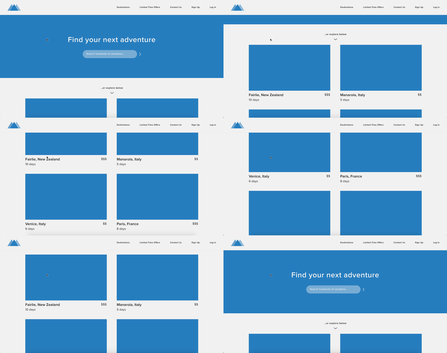
Want your users to have full control over how they navigate your website? With a “sticky” nav bar, the element follows the user as they scroll! To create one in Figma, just follow these steps:
1. Create your main page. For this example, we created a 1440 x 1890 frame for a fictional travel company’s website. We added a landing section with a tagline and search bar above the fold, then some trip items arranged in two columns below the fold. Make sure to create enough vertical content to scroll through.
2. Create your nav bar. We added a 1440 x 96 rectangle on top of the main page, including a quick logo on the left, and some nav items on the right. We then grouped all these elements together, and labeled them “Header” in our Figma file.
3. Make your nav bar sticky. First, make sure your header group is selected. On the right-hand side of the Figma interface, you’ll see three tabs: Design, Prototype, Code. In the Design tab, under the section called “Constraints”, check the box that says “Fix position when scrolling.” You’ll notice a small change in your layer list on the left: Your header group will now have a “Fixed” label above it, while all other content in your frame will be nested below a “Scrolls” label.
Last, see it in action! Click the Play/Present icon in the top-right of the Figma interface (it’s just to the right of the blue “Share” button). This will open your file as a prototype in a new tab. Try scrolling, and watch as your nav bar… goes nowhere!
Make an iOS-style modal
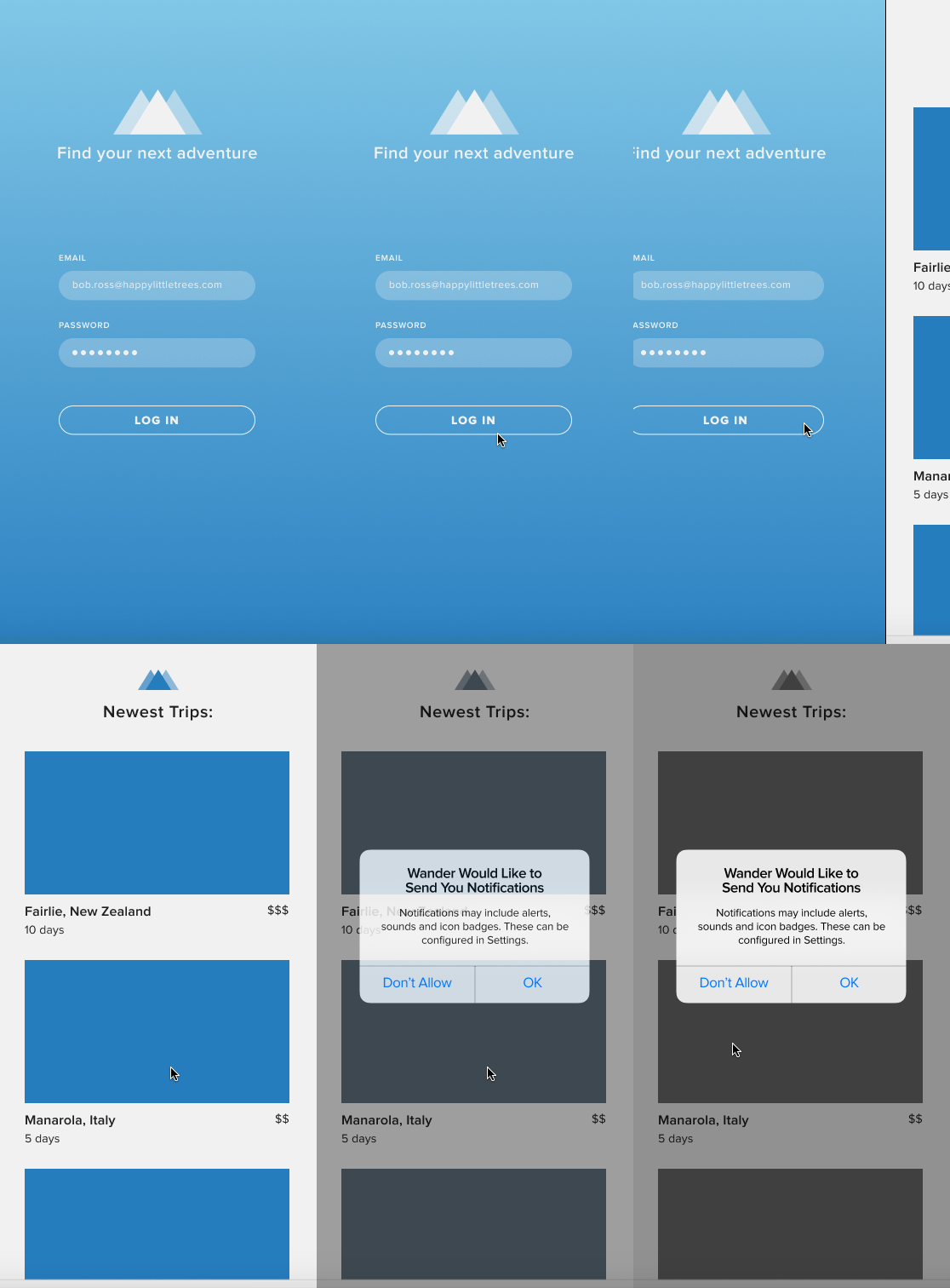
When creating ”high-fidelity” prototypes, it can be important to give users a realistic experience of how your app or website will behave, particularly at crucial points like setup and onboarding. Follow these instructions to make the kind of iOS-style modal that might popup when opening an app for the first time.
1. Create your first screen. For this example, we created a 375 x 812 frame for an app’s login screen. Since our main focus will be the modal that pops up on the next screen, all we want to show here is the user clicking the login button to take them to that next screen. For this reason, we made it look like the email and password fields are already filled out.
2. Create your second screen. In our case, this is the app’s home screen, again for a fictional travel company showing a list of trips.
3. Create your third screen! ...which is really just a duplicate of the second screen, with an modal overlaid on top of it. After duplicating our second screen, we added a partially transparent (40% opacity) black rectangle on top, and then added an iOS-style alert on top of that.
4. Add your first screen transition. First, click the “Prototype” tab on the right sidebar in Figma, then select the frame for your first screen.
- For the Interaction, select “On Click” from the dropdown.
- For the Destination, select the name of your second frame from the dropdown menu.
- For the Transition, select “Push” from the Behavior dropdown.
The default selections for Duration, Direction, and Easing should work fine, but feel free to play around with these to see what looks best for your project.
5. Add your second screen transition. First, select your second frame.
- For the Interaction, select “On Click” from the dropdown.
- For the Destination, select the name of your third screen/frame in the dropdown.
- For the Transition, select “Dissolve” from the Behavior dropdown.
Last, see it in action! Click the Play/Present icon in the top-right of the Figma interface (it’s just to the right of the blue “Share” button). This will open your file as a prototype in a new tab. Click through each screen to see those transitions.
[MID_ARTICLE_CTA]
Make a floating action button
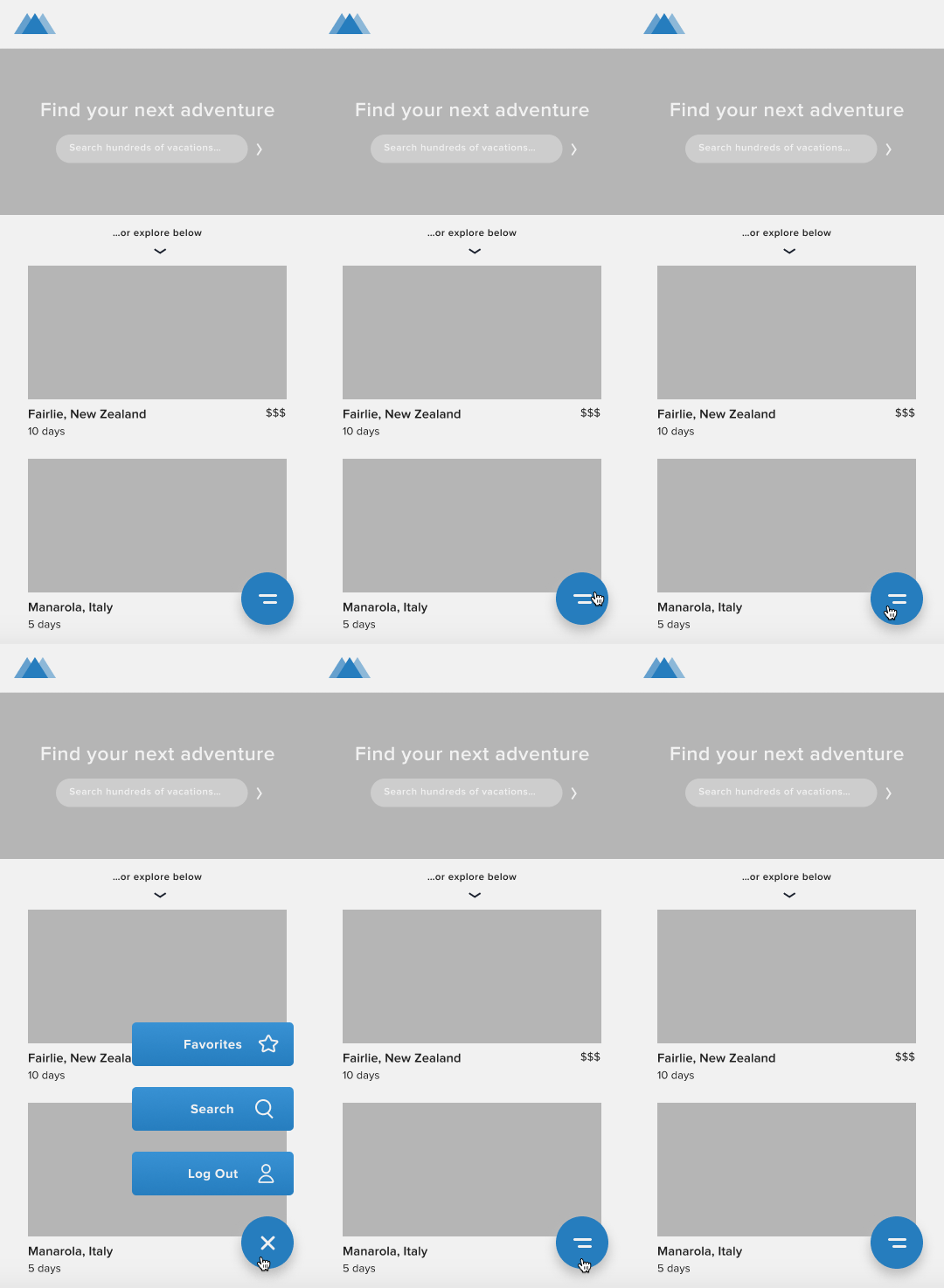
Floating action buttons are FAB. Here’s how to create one in Figma:
1. Create your first screen. We used a 360 x 740 frame for an Android device, and again created a mobile version of our same fictional travel company. This time we used greyscale for our main contents (save for the logo in the upper left), as we wanted the floating action button (FAB) to stand out in our blue accent color.
2. Add your FAB. Ours is a blue 60 x 60 circle with a drop shadow, with a margin of 24 to the right and below. We went with simple double lines to indicate that it would open a menu of some sort.
3. Create your second screen, which will be a duplicate of your first screen, except with the addition of the FAB’s expanded menu. Clicking a FAB can open a wide variety of menus with many different looks, but in the interest of simplicity, our menu is just three floating rectangular buttons. Note that the icons on FABs usually change when the menu is visible, often to an “X” to indicate that the user can close/collapse the menu.
4. Add your transitions. First, click the “Prototype” tab on the right sidebar in Figma, then select the FAB on your first screen/frame (the one without the menu expanded).
- For Interaction, select “On Click”.
- For Destination, select the name of your second frame.
- For Transition, select “Instant” from the Behavior dropdown.
Next, select the FAB on your second frame (the one with the menu expanded). You’re going to select all the same items again in the Prototype sidebar, but this time the Destination will be your first frame.
Last, see it in action! Click the Play/Present icon in the top-right of the Figma interface (it’s just to the right of the blue “Share” button). This will open your file as a prototype in a new tab. Click the floating action button repeatedly to toggle between the collapsed and expanded menu states.
Set up a slide-in menu
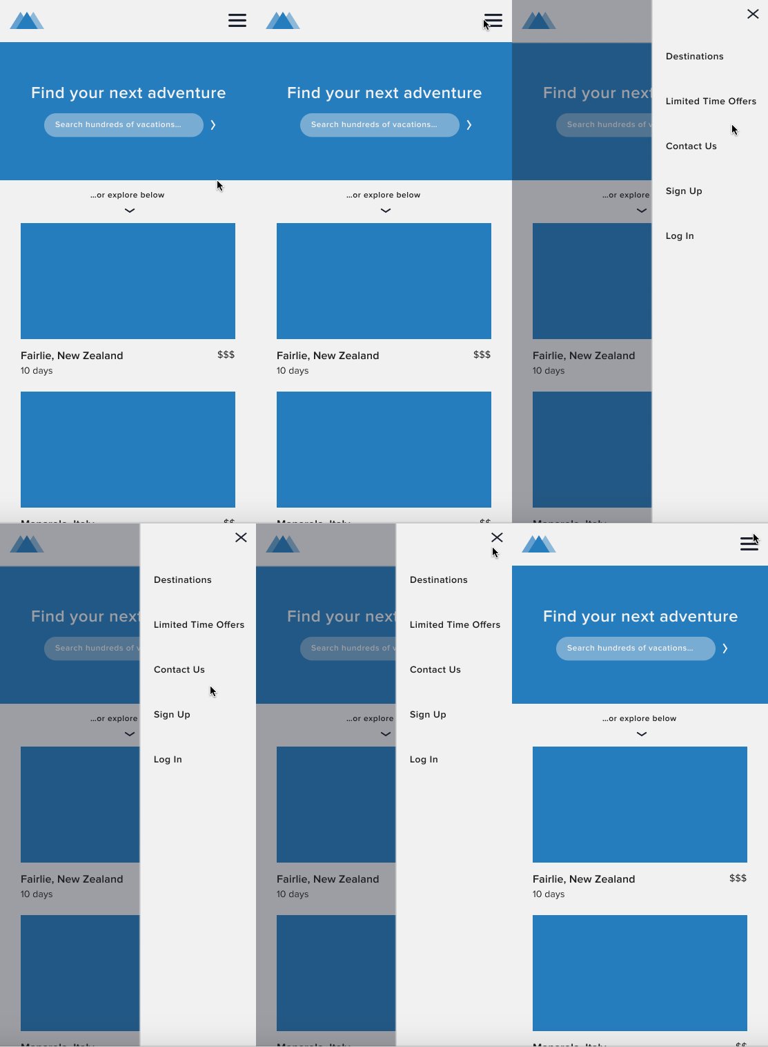
You'll have interacted with many a slide-in menu when using mobile apps. Prototype your own by following these steps!
1. Create your first screen. For this example, we used a 375 x 812 frame for an iOS device, again for a mobile version of the same fictional travel company site. The key element here is the hamburger icon that we placed in the right of our top nav bar, which the user will click to trigger the slide-in menu.
2. Create your second screen, which again is just a duplicate of your first screen but with the slide-in menu on top. After duplicating our second screen, we added a partially transparent (40% opacity) dark rectangle on top (#1B212D), and then added a light (#F1F1F1) 169 x 812 rectangle on top of that, aligned to the right. We added a stack of menu items, left aligned, and an “X” in the upper right.
3. Add your first transition. First, click the “Prototype” tab on the right sidebar in Figma, then select the hamburger icon in your first frame.
- For Interaction, select “On Click”.
- For Destination, select the name of your second frame.
- For Transition, select “Instant” from the Behavior dropdown.
4. Add your second transition. Depending on your project, you may want the user to specifically have to click the “X” in your menu to close it—in which case, you would select the “X” to add your transition.
For our example, we wanted to user to be able to click the “X” or anywhere outside of the menu to close it, so we’re just selecting our entire second frame to add our transition (Technically this means that while in present mode, you’ll be able to click anywhere within the menu to close it as well, which isn’t quite right... but as of right now, Figma doesn’t allow you to exclude specific objects when adding a transition to an entire frame).
Note that you are going to select all the same dropdown items again in the Prototype sidebar, but this time make sure the Destination is your first frame.
Last, see it in action! Click the Play/Present icon in the top-right of the Figma interface (it’s just to the right of the blue “Share” button). This will open your file as a prototype in a new tab. Click to watch your menu appear and disappear.
You’ll notice that the menu isn’t really “sliding” in from the side; while Figma recently added “Slide” as an option in its Behavior dropdown, at the time of writing this can only be applied to entire frames, not specific objects within frames (like a side menu). Thus, using the “Slide” behavior for this particular example isn’t entirely realistic.
Want to learn more about Figma?
Take our free Figma course , Figma 101, where every day for 7 days you'll be emailed short tutorials, mini-projects, and bonuses like PDF cheat sheets.
Already have some Figma knowledge but want to take your skills to the next level? Check out our Advanced Figma course, where you'll learn the strategies and workflows of the most skilled and experienced product designers in a supportive and mentor-led environment.
And if you want to focus in specifically on taking your prototyping skills in Figma up a notch, check out our new Prototyping in Figma course.


.svg)




.jpg)


