


User Experience Design, or UX Design, is one of the many design specialisms in today’s design industry.
UX designers typically work on digital projects like apps and websites, and they’re usually involved with all aspects of the design process—not just the visuals. To learn more about UX design job descriptions and what they mean, check out our introduction!
In the rest of this UX design glossary post, we’ll work through some of the terms the UX designer is likely to encounter in their daily work. This is part 1 of a 2-part series—next time we’ll be covering some more advanced terminology.
Above/below the fold: content that is “above the fold” is content that is visible when a page or screen first loads. Content that is “below the fold” is content that is hidden until the user scrolls. This term gets its name from newspaper design—only content in the top half of a broadsheet’s front page can be seen on the shelf.
Affinity map: a way of interpreting and grouping insights from a user research exercise. For example, in an exercise asking people their favorite dish, those dishes could then be sorted into affinity based on national cuisine (e.g. Italian, Mexican, French).
Affordance: the shape of a button alone gives the user a clue as to how it can be used.
Affordance: any user interface (UI) design pattern that gives a visual clue as to how an element can be interacted with. Affordances often take cues from the physical environment. For example, in UI design, an on-screen button resembles buttons that people are used to seeing in physical products.
Agile/Agile UX: “Agile” describes a software development methodology, which can also be applied to other disciplines like design. It expresses the idea that design work shouldn’t be a single discrete step in a longer process. Instead, it should involve other departments and stakeholders throughout the process, to improve a design iteratively through collaboration and insights from many perspectives.
Android: the operating system, developed by Google, that runs on 88% of the world’s smartphone handsets.
Application Programming Interface (API): an API allows two different pieces of software to interact. For example, Facebook’s API allows other apps to access data it holds and use that data to support their own functionality.
Back-End Development: an engineering role that is focused on how a product is programmed “under the hood”. This is focused much more on computation and database functionality—a front-end developer typically handles the visual side.
Backlog: a queue of work that needs doing on a product. A backlog is not a negative thing, since there will always be more to work on than there are time or resources. Also, since many modern products are initially released as “minimal viable products”, there is design and engineering “debt” effectively designed in from the beginning. (See also minimum viable product, debt.)
Breadcrumb: a breadcrumb is that little string of links that you sometimes see when you’re browsing through a complex content structure. For example, on eBay, you might see: eBay > Clothes, Shoes & Accessories > Men’s Clothing > Men’s Shirts at the top-left of the page.
Bug: some aspect of a feature or product that isn’t working properly. It is common for even very good products to have hundreds of bugs. Bug reports typically go into a backlog of development work, and are fixed over time. Although many bugs are trivial, some can cause serious usability problems or security threats, and those are typically escalated to the top of a development roadmap for rapid resolution.
Button: an interface element that, when tapped or clicked, triggers a specific action (like submitting a form).
Call-To-Action (CTA): any visual or interface element that invites a specific action from the user. In apps and websites, CTAs often take the form of a short snippet of text, followed by a button.
Card Sorting: an exercise where participants are asked to sort a batch of cards into different categories based on their interpretation. It’s a way of understanding how people intuitively associate different items with one another. This can then be used as a basis for navigation structure or other decisions around information architecture. (See also: information architecture, navigation)
Chatbot: An automated or semi-automated feature, typically found on a website or in messaging apps, to allow a user to receive automated answers to their queries using a conversational pattern.
Checkbox: a UI element that allows the user to make a binary (yes/no) choice for a specific option.
Content Management System (CMS): typically a web-based tool that allows a company to edit the content of webpages, or post to a blog, without having to get their developers involved in updating the site.
Conversion Rate: the rate at which visitors to a specific site, page, or screen, complete an intended flow or action. For example, a landing page that had 4000 visitors and 2000 signups has a 50% conversion rate.
Conversion Rate Optimization (CRO): the practice of making changes to a design to increase the rate at which visitors to a specific site, page, or screen complete an intended flow or action.
Customer Experience (CX): this is a term borrowed from service design, another discipline focused on the overall design of large services that might contain many different products and touchpoints. Therefore, customer experience (CX) tends to be broader in scope than user experience (UX). UX is focused on a person’s interaction with an app or website, while CX is more about that person’s overall experience of a brand, including advertising, product quality, and customer support.
Customer Journey Map: this concept is also borrowed from service design. It is a document that shows how a customer moves through an entire service, and the different touchpoints they encounter. For example, if someone uses an airline, their customer journey is about more than just the flight: it also includes searching, booking, checking in, waiting in the departure lounge, complaining, and so on. (See also user journey.)
Customer Relationship Management (CRM): typically refers to a tool that helps a company deal with inbound support tickets, and sometimes email marketing as well.
Debt (Design Debt and Tech Debt): in the context of design and development, “debt” results from shortcuts taken in the process of rapidly developing the first version of a product. It describes design decision that are made in the knowledge that there will be a need to go back and improve upon them. (See also minimum viable product.)
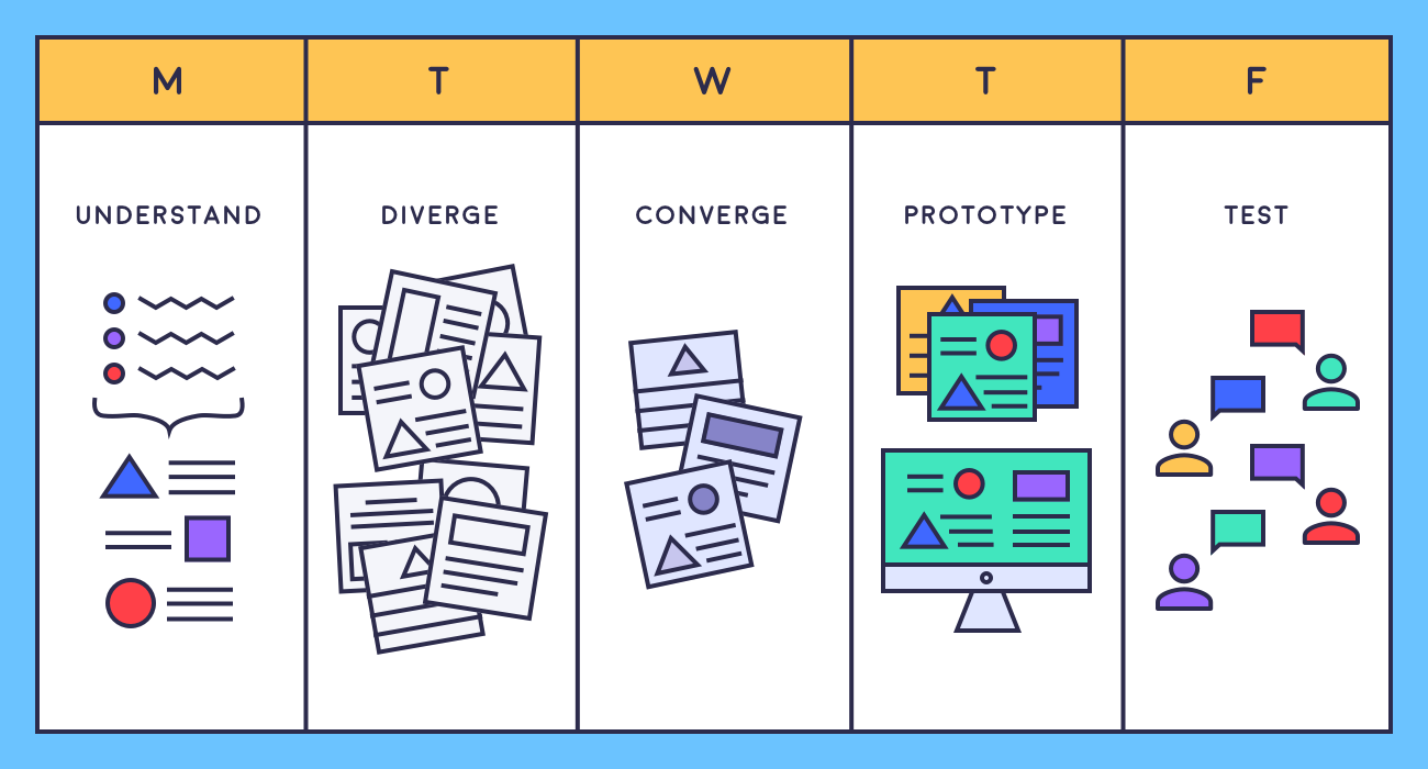
Design sprint: the five stages.
Design Sprint: a collaborative methodology for rapidly identifying and solving a design problem. The five stages of a sprint are: define the challenge, diverge (ideate possible solutions), converge (choose the strongest concepts to develop), prototype, and test. Read more about design sprints here.
Design System: a library of user interface elements, components, and guidelines that are used as the basis for any new and updated features in a product. The purposes of a design system include: maintaining consistency across a product when new features are added; making it easier to update components across an entire product; and reducing the amount of development time involved in any project. Atomic Design by Brad Frost has been a very influential framework for thinking about design systems in recent years.
Design Validation: the process of testing to ensure that the design of a product or service meets the needs intended. A design which meets the needs it set out to is described as “validated”.
End User: any user of an app or website. Note that not all end users are customers: almost every product has end users within the company too. (Considering the broadest possible definition of “users” is one of the features of service design.)
Eye Tracking: an advanced method for assessing the visual hierarchy of information on a screen. Eye trackers record where the user is looking on a screen and for how long. Results are often displayed in the format of a “heat map”; this information can then be used to optimize a design.
Fidelity: a concept in both wireframing and prototyping. Low-fidelity wireframes and prototypes aim to cover basic layout and links between screens, while high-fidelity prototypes and wireframes aim to be very close to final visuals and functionality.
Flat Design: a design trend that followed skeuomorphism. It moved away from both the imitation of realistic surfaces, and the creation of digital interface elements that realistically reference physical interfaces. Instead, it favored simple blocks of flat color, making labeling and iconography more prominent, and increasing the visual simplicity and clarity of interface designs.
Floating Action Button (FAB): a user interface (UI) element that sits on top of a screen design, often in the bottom-right-hand corner, and doesn’t move when the user scrolls. An example of a FAB is the floating “plus” button in Gmail’s interface. Learn how to prototype a FAB in Figma!
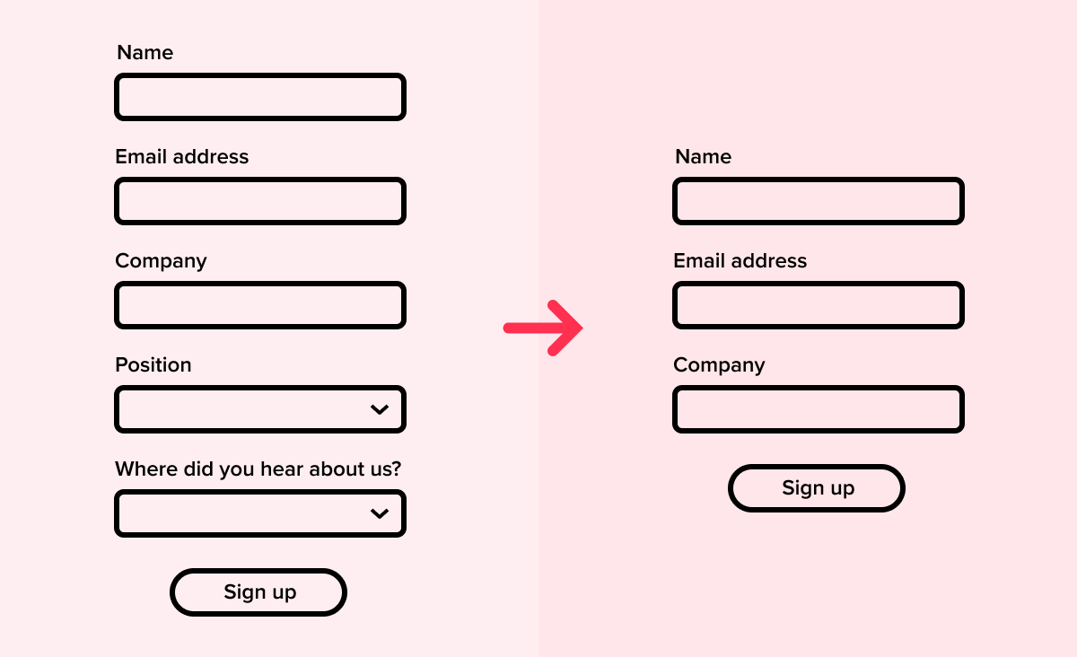
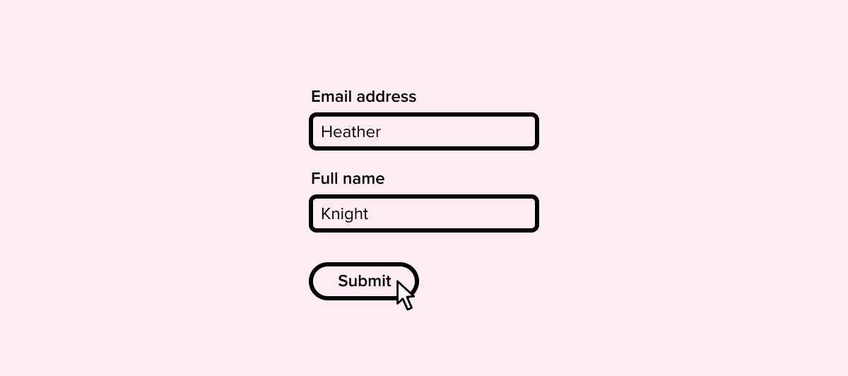
Form: the usability of forms usually improves if they can be made shorter.
Form: a UI element that gathers information from the user. Forms range from extremely short to extremely long. An example of a very short form is an email signup, which may have only an email address field and a submit button. An online loan application, however, might have a series of long forms in the flow. Check out our form design tips.
Frame (in design software): in design packages including Figma, a “frame” is another name for an artboard. Learn more in Figma 101.
Frame (in HTML): a region of a webpage that loads another HTML file inside it. Frames used to be much more widely used on the web, but are now almost obsolete, partly because they tend not to work well in responsive web design.
Front-End Development: a development role focused on engineering the visual appearance and interaction behaviors of a site or app. Front-end development skills typically include HTML, CSS, and Javascript.
Full Stack: typically heard in the context of “full-stack developer”. The term refers to a person or role, and means that the person has both front-end and back-end development skills. It’s becoming increasingly common to hear the term “full-stack designer”—this typically means that the person has a mix of UX, visual/UI, and graphic design/illustration skills.
Gestalt Principles: a set of visual principles of grouping, underpinned by the idea that elements sharing proximity or features in common tend to be understood as related to one another.
Github: a code hosting and versioning platform often used by developers.
Graceful Degradation: the practice of designing and developing a product in such a way that it continues to perform acceptably in suboptimal conditions, such as loading across very low bandwidth or in a very old browser. (See also progressive enhancement.)
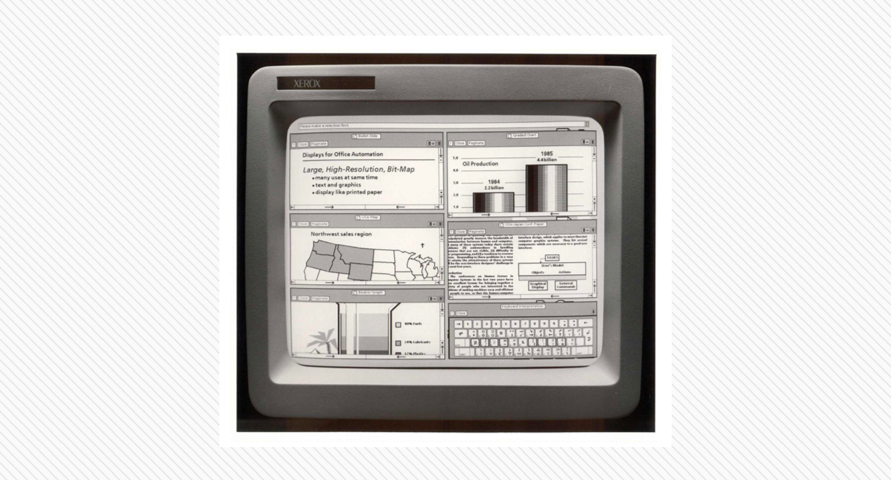
Graphical User Interface: the Xerox Star (1981) had one of the first mainstream GUIs.
Graphical User Interface (GUI): any interface that is interacted with primarily through information displayed on a screen. The first GUIs date back over 50 years; smartphones and smart watches remain examples of GUIs, although they may now also be controlled by voice. Read more about GUIs in our blog post.
Graphic Design: a design discipline focused on the creation of visuals for posters, magazines, packaging, etc.
Graphics Interchange Format (GIF): a legacy web graphics format. It has found renewed popularity because it allows frame-by-frame animation. It’s now used almost exclusively for animation, but beware! Animated GIFs can create large file sizes.
Grid: a layout constraint that determines the positioning of user interface elements on a screen or page. Grids are fundamental to effective design systems. You can check out our introduction to grids in design. (See also design system.)
Hack: in software development, a hack is a quick solution to a specific problem or bug, but which probably won’t be a long-term solution.
Hackathon: a collaborative event where designers, developers, and others come together to rapidly create a functioning product by the end of the event. They can be just for fun, or they can be a professional tool to rapidly ideate and problem-solve, much like a design sprint.
Hamburger Button: a visual pattern of three (or sometimes two or four) horizontal lines that typically indicates a hidden menu. Tapping or clicking it reveals the menu.
HyperText Markup Language (HTML): a markup standard used for coding web pages. HTML has gone through many iterations, the latest of which is HTML5. Web standards are informally coordinated by the W3C organization, and you can begin learning about HTML at W3schools.
Information Architecture (IA): the structure and organization of information in a website or app. In UX design, it tends to refer to the process of organizing content and creating a navigation structure that makes sense to the user and allows them to find what they need in a logical way.
iOS: The operating system that Apple’s iPhones and iPads run on.
Iteration: the process of repeatedly gathering feedback on a design solution, and acting on that feedback to make targeted improvements and move towards a final design.
Landing Page: a web page that is designed to direct users towards a single specific action, like signing up or making a purchase. A landing page is different from a homepage, which typically presents many possible actions to a user. Check out our tips on landing page design.
Meetup: an event where UX designers meet to network, share experiences, collaborate on projects, critique one another’s portfolios, and connect with job opportunities.
Minimum Viable Product (MVP): a barebones version of a product that is designed specifically for early release, to test marketability and whether further resources should be invested in developing a fully-featured product.
Mobile Usability Testing: usability testing conducted on a mobile device being used in an appropriate, realistic context. For example, an app giving driving directions should be tested in that setting, rather than in an office.
Modal: also known as a modal window, modal dialog, or modal pop-up. A kind of in-window or in-app dialog box that either displays a message to be dismissed, or invites some kind of action from the user. Modals are often seen when people first land on a website, for example to offer a voucher code or encourage the user to sign up. They’re also often used to convey important information, like advance notice of a service outage.
[Enjoying this glossary? Check out our Design 101 and UI Design short courses and continue your learning with a mentor. Find out more!]
Navigation: an element of user interface (UI) design that manages how users move between sections and features in an app or website.
Near Field Communication (NFC): a technology that allows two physical devices that are in close proximity to share information. This is the technology that allows you to use your smartphone handset to pay at checkouts.
Net Promoter Score (NPS): a management tool that measures the satisfaction and loyalty of a product’s customers. An NPS score ranges from -100 (worst) to +100 (best).
Onboarding: this refers to the steps that a user goes through when they first open up an app or join a service. Onboarding is an extremely important part of the overall user experience. Even if you have a user-friendly product, people are likely to abandon it during onboarding if they are not brought up to speed effectively.
Open Source: the practice of making code or other design collateral publicly available for inspection, copying, reuse, and modification.
Paper Prototyping: the creation of a product prototype using rough, sketched interfaces on pieces of paper. Paper prototyping is often used in design sprints and any other setting where rapid prototyping is needed. Check out our post on rapid prototyping in design sprints.
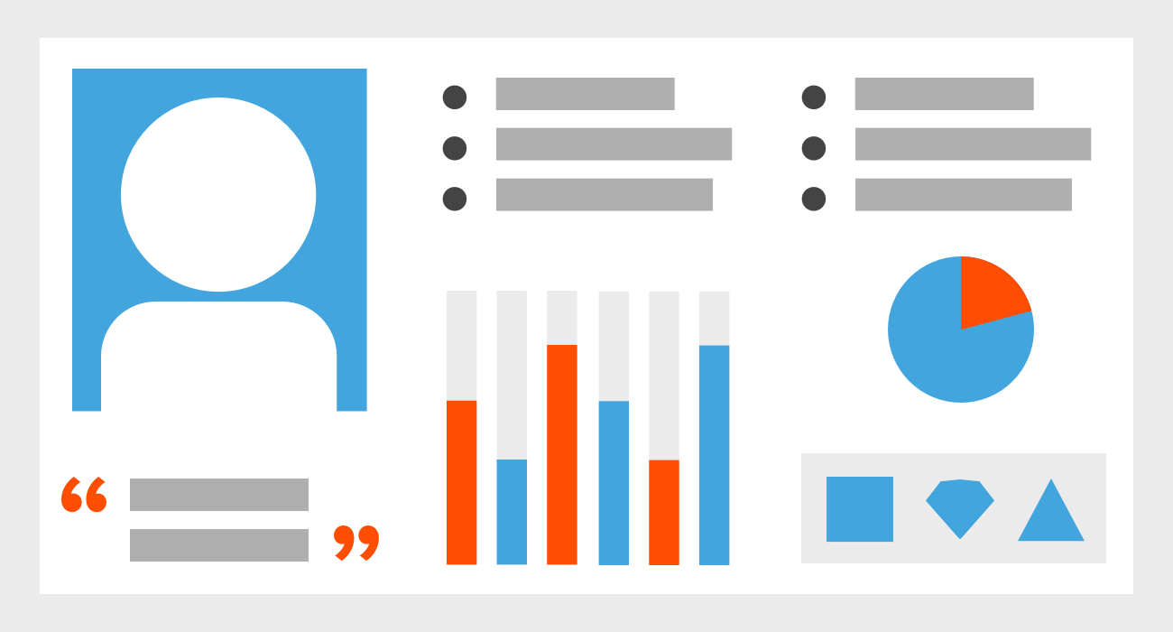
Persona: a snapshot of a target user archetype.
Persona: a persona is a document that takes findings from multiple user research data points (such as interviews and questionnaires), and synthesizes them into an archetype. Although the “person” in a persona doesn’t exist as a real individual, each persona comes to represent an idealized end user of a product.
Picker: a picker is a UI element that allows the user to choose, for example, a date, time, or color. Pickers tend to be used where there is a very high number of options, or the input is highly conceptual.
Plus Button: a UI element that typically allows the user to add a new item, or start a new document or file. (See also floating action button.)
Progressive Enhancement: the practice of adding functionality or visual finish as technical constraints are removed. For example, a browser that supports cutting-edge web standards might allow extra touches when it comes to interaction and animation. Read more about progressive enhancement at Smashing Magazine.
Progressive Web App (PWA): an app that runs in a web browser, but has a level of functionality more like traditional standalone software. Examples of PWAs include project management platforms like Asana, and social media sites like Twitter and Facebook.
Prototype: an interactive mockup of an app, website, or device. Typically used to illustrate a concept and gather early feedback from users and other stakeholders. The advantage of a prototype is that it can usually be built quickly, and without having to engage engineers/developers. Prototypes can also encourage people to focus on usability rather than aesthetics. Prototypes can range from low-fidelity (e.g. an interface sketched on pieces of paper—known as “paper prototyping”) to high-fidelity (e.g. a website prototype that includes final graphics—see also fidelity).
Responsive Web Design: the practice of creating websites that are optimized for the device they are being viewed on. Today, almost all websites are designed responsively. It means, for example, that a website will look quite different in terms of layout between desktop and mobile, but that the text should be the right size for easy reading in each case.
Return on Investment (RoI): the extent to which expenditure of time, money, or effort is returned in the form of positive results, such as increased revenue. RoI can be positive (it yielded more than it cost) or negative (it cost more than it yielded).
Scalable Vector Graphics (SVG): this is a graphics file format that has been around for a long time, but is now supported by mainstream web browsers, so is being used more often online. The advantage it has over pixel-based graphics formats like PNG and JPG is that an SVG can be resized infinitely without losing quality. This is because the file is saved as a set of mathematical data about curves and points, not as an array of color values for individual pixels.
Scrum: a set of project management practices emphasizing daily communication, flexible planning, and short, focused phases of work.
Search Engine Optimization (SEO): the practice of shaping web content to maximize the ranking of webpages in search engines like Google.
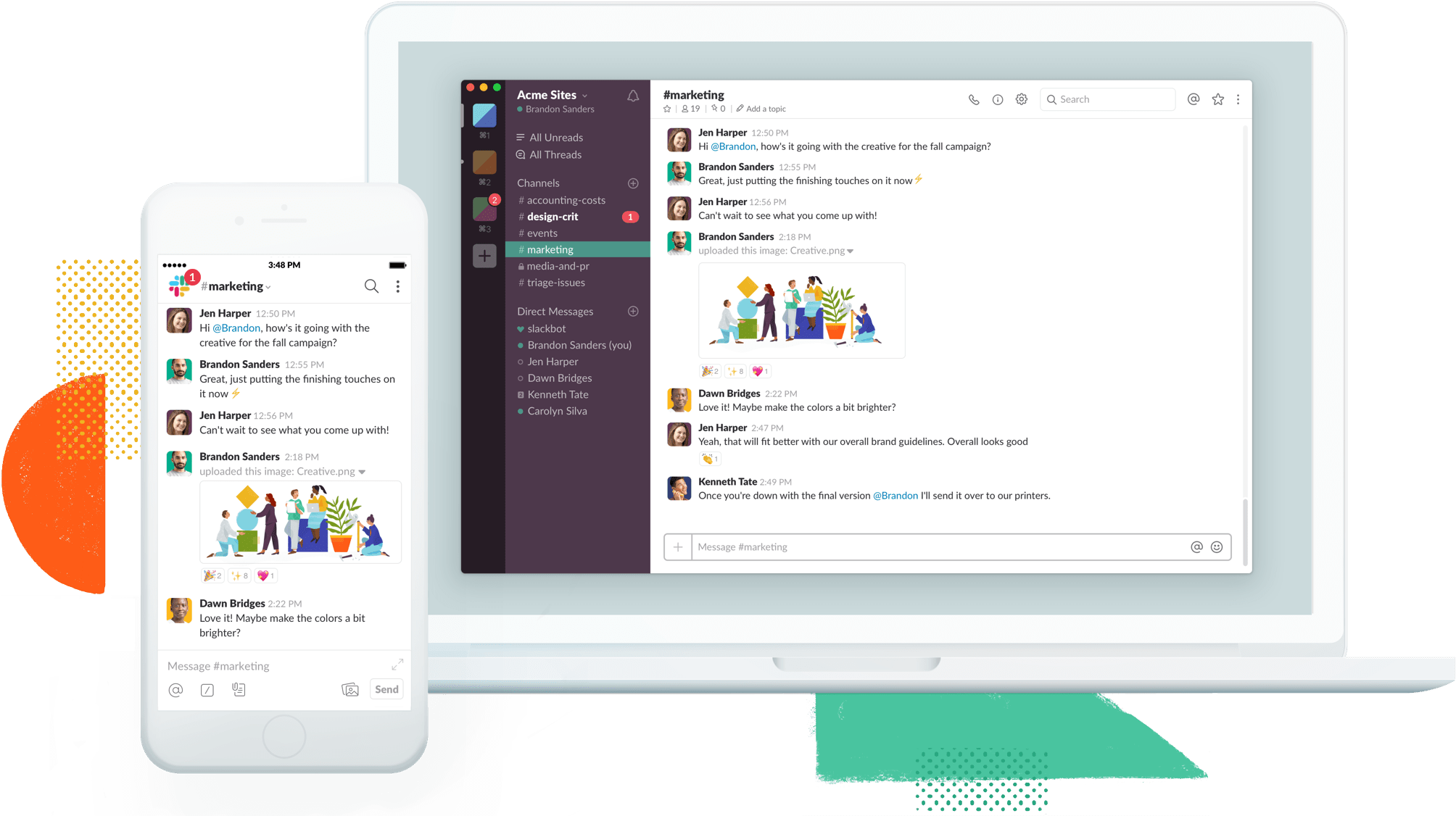
Slack: widely used by remote teams.
Slack: a collaboration and communication tool used by many distributed design and development teams, often effectively replacing internal email.
Software as a Service (SaaS): the practice of delivering software via online subscription, rather than as a standalone product that is purchased one-off. An Office 365 subscription is SaaS; Office 97 on a CD-ROM is delivered as a one-off license.
Switch or Toggle: a UI element that allows the user to turn a setting on or off.
Task-Based User Testing: testing of a digital product that involves setting the user a task or set of tasks to complete. The user is then observed completing the tasks, and may be asked questions after the test. This kind of testing is particularly helpful in establishing how intuitive a product’s navigation and information architecture are.
Testing: any process that involves getting people to use a product for the purpose of gathering insight into its strengths and weaknesses, its performance, or to get targeted feedback.
Usability Testing: the practice of getting users to test, or experts to analyze, the usability of an app or website. (See also task-based user testing.)
User Experience (UX): distinct from user experience design, UX refers to the user experience itself. For example, a product that currently has a poor user experience would benefit from better user experience design.
User Interface (UI): the front-end of an app or website that the user directly interacts with through an input device.
User Journey: a description of the steps a user will go through when using a product. This usually takes the form of some kind of diagram, but formats vary widely. Journey mapping is also a concept in service design. Read more about the difference between UX design and service design in our blog post. (See also customer journey map.)
User Scenario: a story-like description of a specific situation or chain of events in which a user might interact with a product. User scenarios help designers and developers understand the context in which a product is realistically going to be used, and to grasp any special constraints or opportunities that situation presents.
UX Analytics: the use of data—like detailed app usage statistics—to inform UX design decisions.
Waterfall: a software development methodology that requires the completion of one stage in a process before the next can begin. For more about waterfall methodology, check out our post on UX design process.
Wireframe: a rough version of a screen design that allows the designer to rapidly explore different options for layout and visual hierarchy and gather feedback through testing. Typically, a wireframe does not include any decision-making around color or typography, although wireframes can range from low- to high-fidelity. (See also fidelity.)
We hope you found this glossary helpful! We’ll be back with part two of this UX/UI glossary in a few weeks. Sign up below if you’d like to be notified when we publish it!
Header image: Jose Alejandro Cuffia via Unsplash


.webp)


