


A while back, we took a look at how to get started in user experience (UX) design. In this article, we’re going to follow that up by looking in a little more depth at one aspect of UX—user interface (UI) design.
In this installment, we’ll explore the importance of interfaces, examine how UI design is distinct from UX design, and take a brief look at the history of UI design. Don’t forget to check out Part 2, where we discuss what UI design means today, look at some case studies, and point you to further resources.
1. Why UI design?
Often UX and UI are bundled together in courses and job titles, but it’s important to understand that there is a difference. UX describes the user experience as a whole, taking in not only the user’s interactions with a particular site or app, but also their overall feelings towards the product or brand, and whether it meets their needs.
UI design, on the other hand, is focused specifically on how a user interfaces with a product. It’s about designing effective screen layouts and transitions between steps in the user’s journey. UI is about the fine detail of how the user will reach their goals, not the overall user experience.
Here’s a summary of how UI and UX responsibilties differ:

This popular blog post on the topic is worth a read for more on the difference between UX and UI.
2. What is a user interface?
A user interface is the “front end” of a device or app—the part that the user interacts with in order to complete a task. The UIs that we are most familiar with today are probably those on our smartphones, but we could also point to the UI design of our alarm clocks, dishwashers, and car radios. UI design is all around us because, as users, we need to interact with most of the objects that make up our domestic and industrial environments.
The primary purpose of a user interface is to allow the user to give a command to a device, causing that device to respond by performing a process. The design quality of a user interface is largely measured by the efficiency and accuracy with which a) the user can give those commands, and b) the device can respond effectively and appropriately. UIs also facilitate communication in the opposite direction, notifying or alerting the user to events that need their attention or interaction.
Simply put, a UI is what enables a person and a machine to interact. Typically, personal computers, tablets, and smartphones present human-friendly information on a screen, and the user responds to that information by clicking, tapping, scrolling, and typing. But from that definition alone, it would be hard to guess just how much user interfaces have changed and advanced in the last few decades.
3. The history of UI design: from command lines to GUIs

The command line in MS-DOS 6.0. (It stands for Microsoft Disk Operating System—and is what PC user interfaces looked like before the introduction of Windows in 1985!)
Thirty years ago, user interfaces on PCs were typically driven by a command line, like in MS-DOS (pictured above). This could be a very efficient user interface—but the user had to actively learn how to interact with it, because specific commands had to be typed in using the correct syntax.
Here’s an example of a simple MS-DOS command, which would list the contents of the current folder:
C:\>dir
But commands with lots of options required the user to remember all the “toggles” that went with the command, and select them correctly, usually without any prompts to help. For example, this one would add two file attributes to the file called “autoexec.bat”, and make the file read-only and hidden:
C:\>attrib +r +h autoexec.bat
Boring, right? As a result, command-line interfaces were usually the preserve of computer enthusiasts, IT professionals, and people who were compelled to use them in their jobs. Command lines were certainly not most people’s idea of fun, and unsurprisingly home computers did not take off in the MS-DOS era. Command lines were an effective user interface for some functions, but offered a poor experience for the general user.
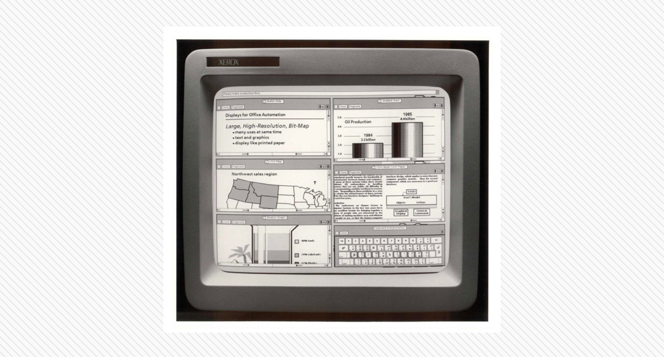
Xerox Star (1981)
To move away from command lines, a number of tech companies developed the first “graphical user interfaces”, or GUIs. The Xerox Star (1981) was the first mass-market device to have a UI based around on-screen windows. Apple followed it with the Macintosh in 1984, and Microsoft with Windows in 1985.


Apple Macintosh (1984, and it still looks familiar) & Windows 1.0 (1985, and it doesn’t).
During the 1990s and 2000s, significant advances were made in desktop UI design. These changes were driven by the increasing importance of computers and other interactive technologies, both at work and in the home.
Although Windows retains its capacity to baffle the average user, Microsoft’s series of Windows releases (95, 98, XP, Windows 7, Windows 10) nevertheless incorporate significant advances in interface design.
Apple followed a similar path of UI advancement through successive releases of Mac OS. In contrast with Windows, though, Mac OS retained significant continuity of appearance and interaction principles from one version to the next. (How users experience the changes between versions of a product is itself an area of UX and UI design that is often overlooked—and indeed is the cause of much of the criticism that traditionally follows a new release.)
The decade since the release of the iPhone in 2007 has been marked by an increasing focus on the UI of smartphones and tablets, and the distinct needs of their users. Apple’s iOS, and Google’s Android (which uses UI principles modeled on the company’s Material Design guidelines) are advanced GUIs that stand at the end of almost 40 years of user interface development.
Check out Part 2!
In the second installment of this article, we discuss what UI design means today, explore some case studies, and offer some pointers to further resources.


.png)


