


Design an App Screen
Figma 101
Create a login screen for your app.


Learning objectives:
- Create a 3-column layout grid
- Learn how to duplicate elements
- Set Layer opacity (transparency)
- Use fill colors and gradients
- Practice locking and unlocking layers
- Consolidate yesterday’s learning
Time to complete: 30 minutes
Today’s tutorial
Welcome to the second day of Figma 101! Yesterday we took a look around the interface and checked out a few of Figma’s core functions. Today, we’re going to be using these commands and more to build the whole first screen of our app!
Over the next few days, we’re going to create screen designs for a photo-sharing app. Feel free to pick whatever name you like—we’re choosing “filter” for ours. Let’s get started!
1. Open up your Figma file, and create the Frame for your app screen.
First things first—open up the same Figma file you were working on yesterday. (It should show up in the “Recent” tab on the Figma home screen.)
Just like we did yesterday, hit [[F]] to select the Frame tool, and pick iPhone SE from the options on the right of the window. Then let’s set a background color for this screen. While the new Frame is selected, look over to the Properties panel on the right of the Figma window. Click the white square under where it says “Fill”, and choose a color. We’ve gone for #2F80ED, which is the shade of blue.
2. Add a column grid
It’s important to work using a column grid, even when we’re designing for mobile. Doing this means that we make positive decisions about spacing and layout—for example, the amount of space we leave between elements and the edge of the screen.
In Figma, it’s super easy to add a column grid. Select the Frame by clicking on it in the Layers panel or on the Canvas, and then hit the “+” icon in the Properties panel under where it says “Layout grid”.
- Count: 3 (this creates 3 columns)
- Gutter: 16 (this adds 16 pixels of space between each column)
- Margin: 16 (this adds 16 pixels of space at the edges of the Frame)
3. Add the name of your app
Let’s create a simple “wordmark” using the Text tool. A wordmark is basically the name of a company or product set in a beautiful way using text only. (Tomorrow we’ll work on a logo!) Press [[T]] to select the Text tool, then click in the frame and type out your app’s name. The settings from when we created the button yesterday may still be in place, so we’ll need to make adjustments. Here’s what we’ve set the text to:
- Typeface: Roboto Bold
- Text size: 42 pixels
- Case: lowercase
(Check out the lovely ligature that joins the f and the i!)
4. Reposition the wordmark
If you click and drag on the text you’ve just created, you can move it around the frame to reposition it. You’ll notice if you drag it near the horizontal middle of the frame, guides will pop up to indicate that the text is centered. Once it’s centered, release the mouse button!
5. Create the username field
We can easily create some sleek login fields just using rectangles and text. First, select the Rectangle tool [[R]] and click and drag to create a rectangle about 250 pixels wide and about 30 pixels high. Notice how Figma displays the size of the shape in numbers as you’re drawing it?
Change the fill color to be white (#FFFFFF). We then need to change the opacity setting to make the shape semi-transparent. This isn't labeled as Opacity like it is in Adobe Illustrator, but it does exist: it's the number shown in the Properties panel under "Layer" next to where it says, "Pass through." It’s set to 100% by default—let’s change that to 25%. You can also set this by simply selecting the object and typing in the opacity value you want. Try it—select the rectangle and simply type “25”. (This is strangely satisfying, you’ll agree.)
Next, press [[T]] to go back to the Text tool. Click anywhere in the frame, and type “Username”. The font will probably still be set to the preferences you used for the wordmark, so once you’ve finished typing, select the text and change it to Inter Regular, the size to 16 pixels, and the case to “As typed” (the dash). Drag the text label over the rectangle. And presto! A form field.
As a final step, make sure that the “Username” text is positioned nicely in relation to the rectangle. You can do this by clicking once on the text layer, and then “nudging” it 1 pixel at a time using the arrow keys. If you hold down [[Shift ⇧]] while using the arrow keys, the selection will move in 10 pixel increments.
6. Duplicate the username field to create a password field
It’s very easy to duplicate elements in Figma. With the Move tool selected [[V]], just drag a marquee (rectangular selection) around the rectangle and text you just created. You can use old-school copy and paste ([[⌘]][[C]] then [[⌘]][[V]] on Mac, or [[Ctrl]][[C]] then [[Ctrl]][[V]] on PC).
Alternatively, you can hold down [[Option]] (Mac) or [[Alt]] (PC), and then click and drag from the selection to make a duplicate.
Place your duplicate objects so that they’re sat directly below the username field. Then, simply double-click the “Username” text and change it to “Password”.
7. Duplicate the button you made yesterday.
With the button you created yesterday, select both the “SIGN IN” text and the yellow rectangle. Group them by hitting [[⌘]][[G]] (Mac) or [[Ctrl]][[G]] (PC). If you look at your Layers panel they’ll now be called “Group 1.” Go ahead and rename that by double-clicking on it in the Layers panel and typing in “Sign In Button.”
One more way to duplicate elements is by selecting an element on your canvas and hitting [[⌘]][[D]] (Mac) or [[Ctrl]][[D]] (PC). Try this with the now grouped button. The duplicate will be placed directly on top of the original—so once you’ve created the copy, just drag it across to the other frame. This shows how easy it is to move elements between frames in Figma—it’s a simple drag and drop.
8. Make the background more interesting
In Figma, we can easily apply gradients to the backgrounds of our frames to make them more exciting. Start by selecting the Frame and navigating to the “Fill” section of the Properties panel on the right. Next, click on the blue color swatch right underneath where it says “Fill.” This will open the color panel. At the top of the color panel underneath where it says “Custom,” hit the Gradient button.
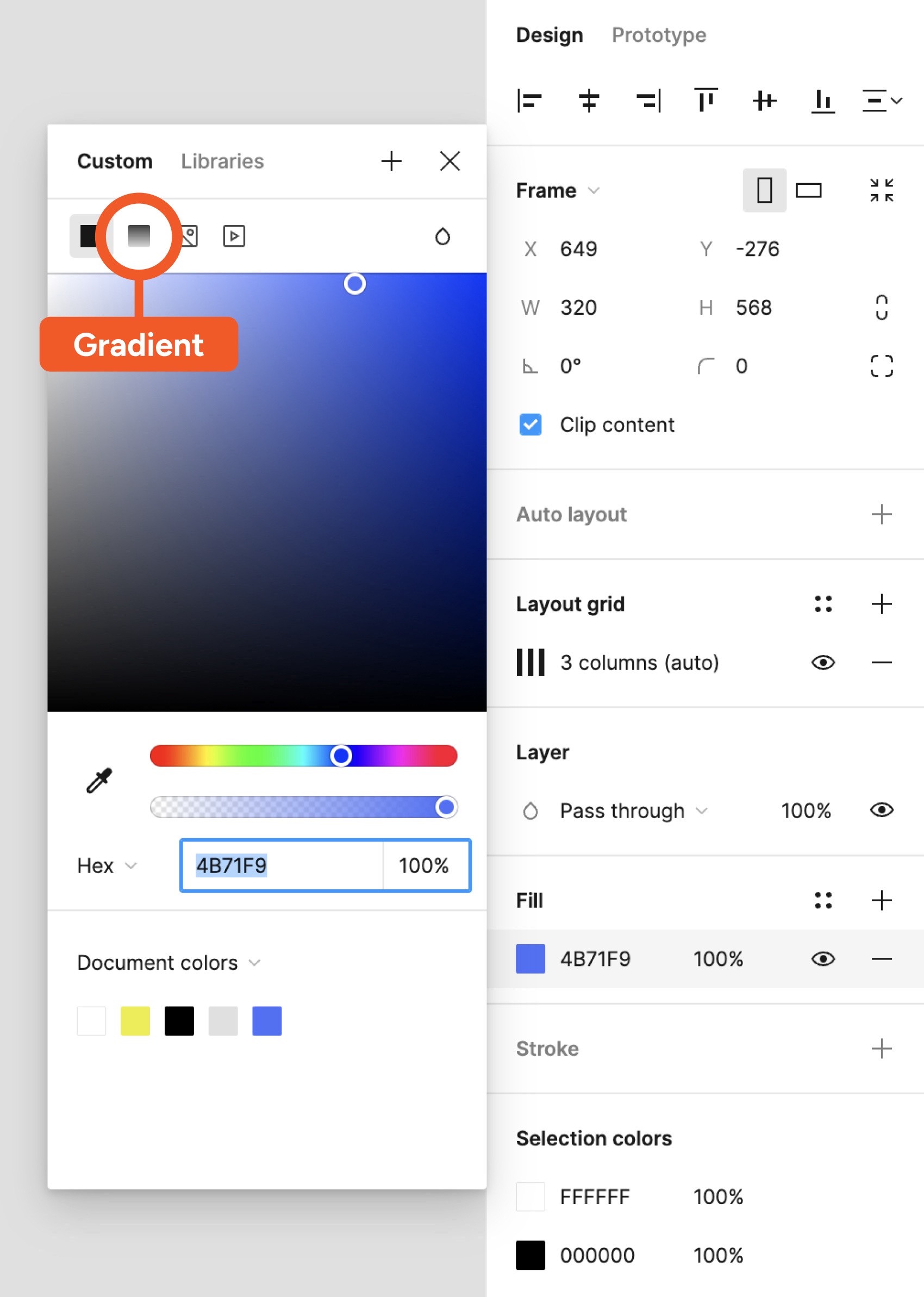
Still in the color panel, select the right color swatch on the gradient spectrum.
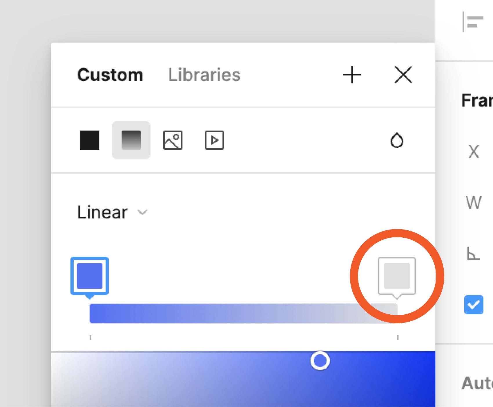
Pick a color that you think transitions nicely into the current background color. Get creative! We’ve gone with a pink (#E36FA6). You might also need to change the opacity like we did.
9. Align & refine the layout
The last thing to do today is to make sure that everything is nicely aligned. Here are some things to check:
- Do the “Username” and “Password” input fields line up with the columns?
- Are all of the interactive elements spaced out enough so that users don’t accidentally tap on the wrong thing?
- Is everything centered to the frame?
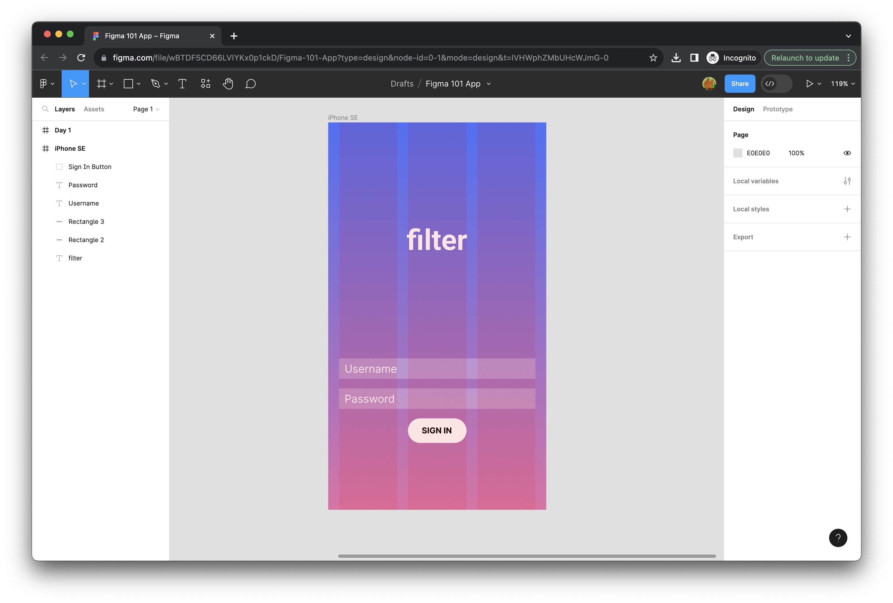
As you can see, we made some other refinements at this stage: we changed the background color of the “SIGN IN” button to white and adjusted the button size so that it occupies the whole width of the column. We also changed the vertical position of the filter logo. Here’s how we did all of that:
Ta-da!
Congrats on completing your first app screen in Figma! How are you going to celebrate this big win? For Day 3, we’ll be designing a logo and some icons using the pen tool. See you then!
Today’s bonuses

Create a logo and icon set
Build a simple logo and icon set using shapes and the Pen tool.
