


Create a Tablet or Desktop Version
Figma 101
Unleash your creativity to adapt your design to tablet or desktop size!


Learning objectives:
- Learn about Constraints
- Research some tablet or desktop design patterns
- Practice adapting the mobile app design for a larger screen size
- Consolidate your app design and prototyping skills
Time to complete: 45 minutes
Today’s tutorial
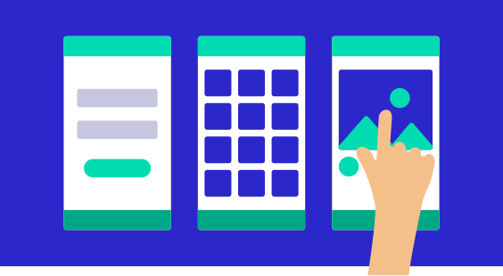
Today, we’re setting you free! It’s time to get creative and make your own designs for a tablet or desktop version of the app, by adapting your existing layouts for a different screen size.
Just before you get started, though, let’s cover one more awesome feature in Figma called Constraints. This is particularly useful to know when transposing a design from one device or screen size to another.
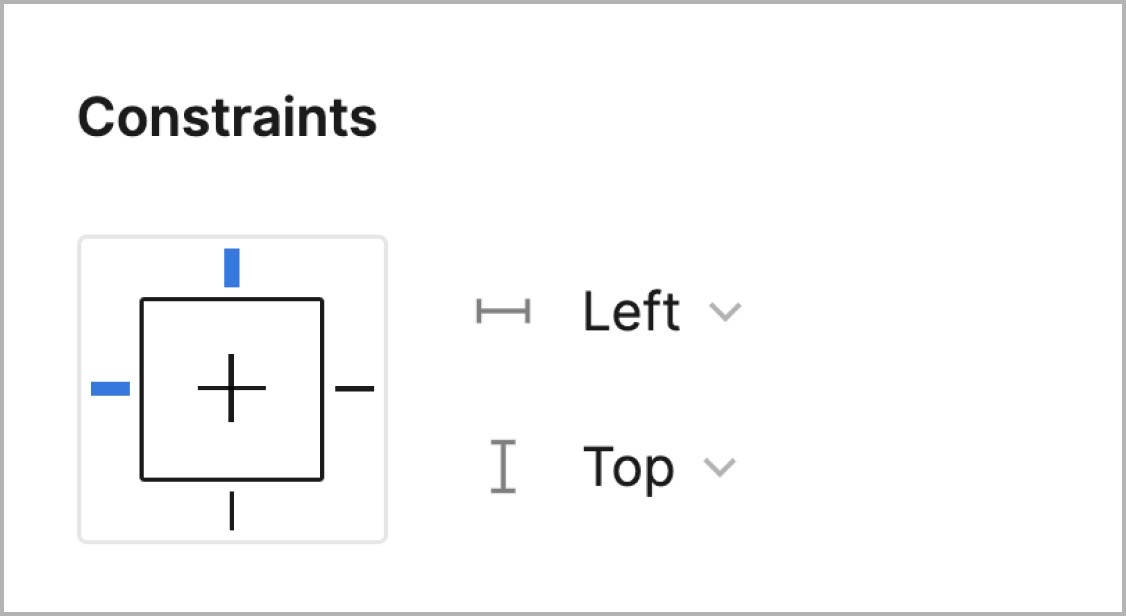
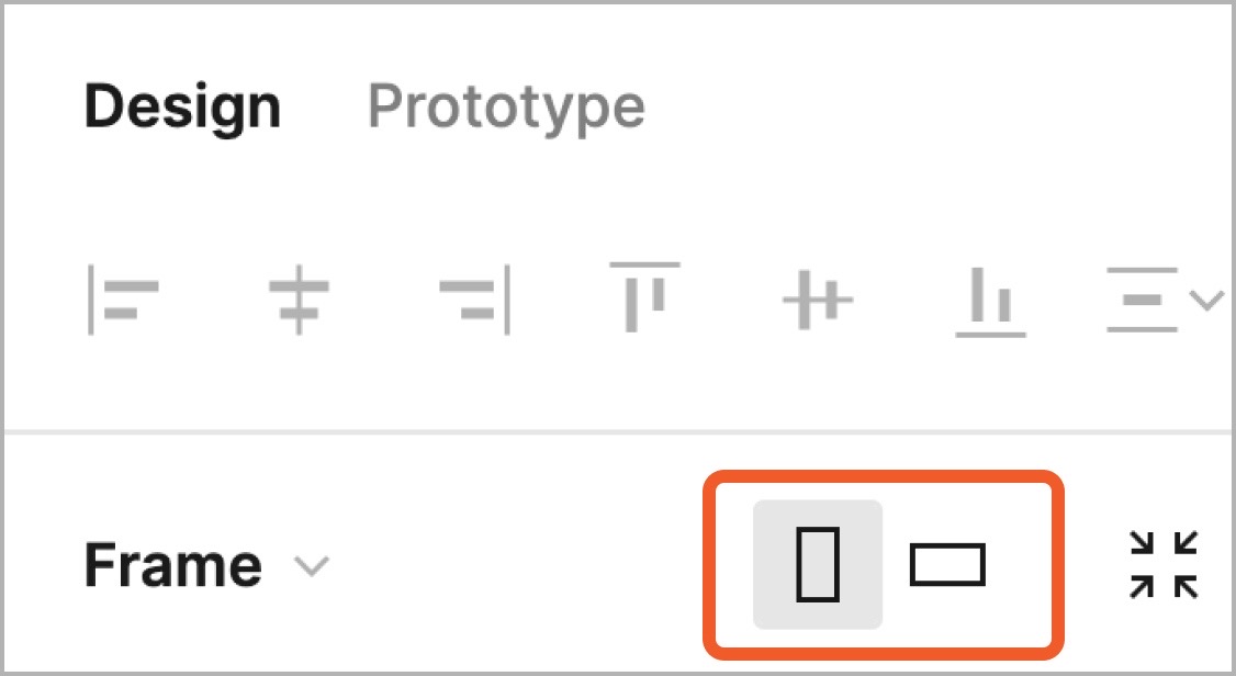
Constraints define how any object will behave if its containing Frame is resized. Each Layer in Figma actually has Constraints set by default—select any object in the canvas and you’ll be able to see these settings in the Properties panel under the Design tab:
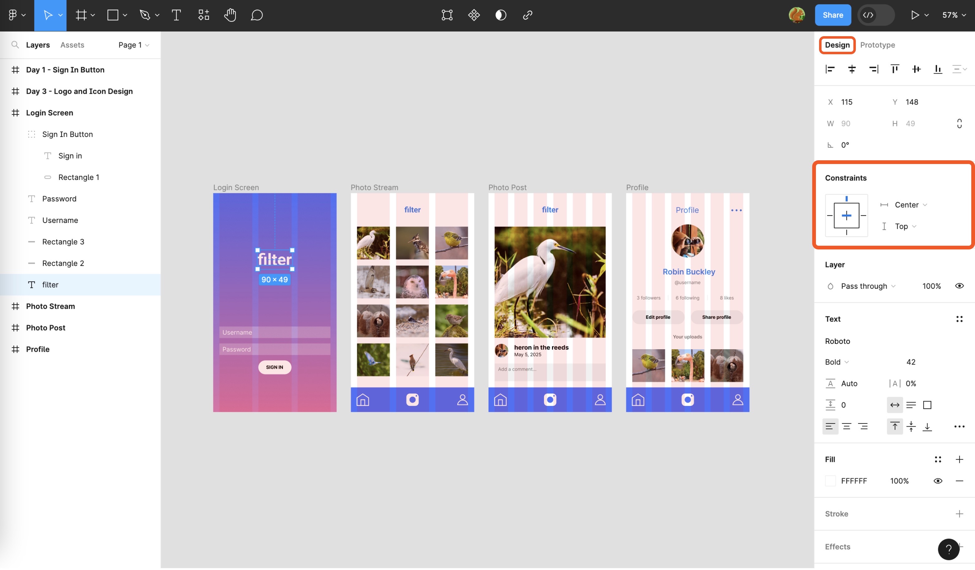
The first dropdown (which here says “Left”) tells Figma how to manage the object’s horizontal position, while the second dropdown (which by default says “Top”) sets its vertical position.
The advantage of Constraints is that we can use them to resize our designs intelligently, which saves us the work of scaling and positioning elements manually. As an example, follow these steps to make the nav bar resizable.
You can apply this method to other screen elements as you develop your tablet or desktop version of the app. To get you started with today’s challenge, first decide on how many screens you'd like to recreate at a larger scale. Don’t feel obligated to do all four, but give at least two a try. Here are some specifications for the Frames and Layout Grids for your chosen device:
Tablet (landscape):
- Hit [[F]] to select the Frame tool
- Click the “Tablet” drill-down menu in the Inspector
- Select “iPad Pro 11”
- Once the Frame has been created, switch the orientation to Landscape at the top of the Properties panel, next to the drop-down we used earlier to switch a Group into a Frame
- In the Properties panel, add a Layout Grid like we’ve done before. Set it to columns with a Count of 12, the Margin at 16, and the Gutter at 32.
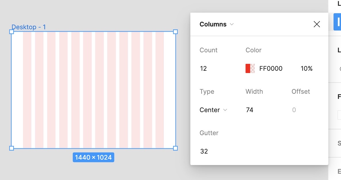
Desktop:
- Hit [[F]] to select the Frame tool
- Click the “Desktop” drill-down menu in the Inspector
- Click “Desktop (1440 * 1024)”
- In the Properties panel, add a Layout Grid like we’ve done before. Set it to Columns and then change the Type to Center, the Width to 74, and the Gutter to 32.
- In the Properties panel, add a Layout Grid like we’ve done before. Set it to columns with a Count of 12, the Margin at 16, and the Gutter at 32.
Tip: When translating your work from mobile to tablet or desktop, it's helpful to have the original mobile screen design right next to the new Frame you’re working on. You can copy elements across or simply use it as a point of reference.
Here’s a checklist to keep in mind as you work on this:
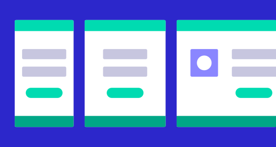
- As a user, what might you want to be consistent between the mobile and tablet/desktop versions of the app? (Perhaps color, or certain layout patterns like in the Photo Post screen?)
- Equally, what might you want to be different? (For example, how might navigation and menus be different on tablet or desktop?)
- Take a look at other websites or apps to get a sense of how the relative scale, sizing, and spacing of elements might need to be different on a larger device.
- Check out the site UI Patterns for some inspiration on how you might want to lay out elements in a different format: ui-patterns.com
Have fun, and look back to previous lessons if you need a reminder on how to do something! In case you get stuck, we’ve included our own versions below that you can use for inspiration—or, if you prefer, have a go at recreating the layouts we made.
Today’s bonuses

Figma Tips and Tricks
Wrap up the course by discovering some extra functions.
