


Design the Next Two App Screens
Figma 101
Add a photo stream and post page to your app.


Learning objectives:
- Learn different ways to insert an image
- Create a circular image using the Mask function
- Design a simple nav bar using our logo and icons
- Duplicate a Frame
- Practice tidying up a layout
- Consolidate our learning so far
Time to complete: 30 minutes
Today’s tutorial
Today we’re going to add two more app screens to the one we already have. Our second screen will be a photo stream, and the third screen will be the page for an individual photo post.
1. Open up your Figma doc and create a new Frame
You know the routine by now—open up your Figma file, hit [[F]], and select iPhone SE. Then set up the layout grid in your new frame—3 columns, 16 pixels gutter, 16 pixels margin.
2. Create the bottom nav
First things first, let’s create the “bottom nav”—the row of navigation icons that are often found at the bottom of the screen in mobile apps. This is also known as the “tab bar” when designing for iOS. Create a rectangle that spans the width of the screen and is 64 pixels tall. Set a fill color for the rectangle—we’ve gone with the blue we used for the background of the first screen the other day (#2F80ED).
For the bottom nav, we also need a profile button. We didn’t create this one yesterday, so we’ll need to use the Ellipse tool [[O]] to create this.
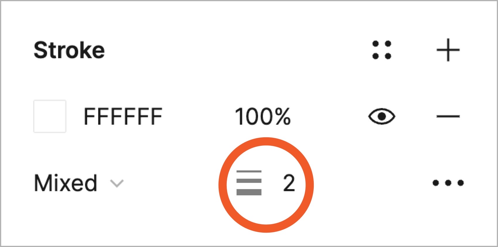
Once that’s done, duplicate and drag across the home and profile icons from the Frame that contains your icons. Let’s align them to the left and right edges of the column grid, respectively. Recolor them to white and increase the stroke weight to 2 Properties panel.
Duplicate and bring over the camera logo. Resize it to match the other two icons and change its color to white as well.
3. Add a small version of the wordmark at the top of the screen
To do this, duplicate the wordmark from the first screen and drag it across to the new Frame. Then change the font size to 20 pixels, and switch the color to match the background color you chose yesterday (ours was #2F80ED). Place the logo towards the top of the frame, making sure it’s centered and there’s a comfortable amount of space above it (our logo is 32 pixels from the top of the frame—remember, you can check this by selecting the logo, holding down [[Option]] (Mac) or [[Alt]] (PC), and hovering over the frame.)
4. Add a photo
There are a few ways to insert a photo into a Figma document. The cleanest way is to use the Place command, which you’ll be familiar with if you’ve used Adobe products. For the next steps, you’ll need some photos to insert. Feel free to use your own—but we’ve prepared a set to download if you’d prefer.
In Figma, the “Place Image” function works a bit differently from other software you might have used. For a start, it won’t stretch an image by default—it masks it instead. Also, if you hold down [[Shift ⇧]] while placing the image, Figma will constrain it to its original dimensions, rather than making it square.
Press [[⌘]][[Shift ⇧]][[K]] (Mac) or [[Ctrl]][[Shift ⇧]][[K]], and select a photo to upload. (You can also access this command via the File menu in the top left.)
Figma will then display a crosshair mouse pointer. Click and drag within the Frame to place the image. We want it to be 1 column wide—and we also want it to be square. You might need to tweak this in the Inspector after adding the image—set the image to be 85 pixels wide and 85 pixels high.
5. Add the other photos and arrange them
Repeat this step to add all 12 photos in the photo stream! You can take this opportunity to experiment with the different ways of inserting photos in Figma. Note that when you insert an image, Figma just creates a rectangle with the image set as the fill.
So you can also do that manually (create the rectangle, then from the “Fill” drop down menu, select “Image” and follow the instructions). Other ways to add an image include dragging an image into the Figma window, and copy + pasting an image—[[⌘]][[C]] then [[⌘]][[V]] (Mac), or [[Ctrl]][[C]] then [[Ctrl]][[V]] (PC). Note that using the copy + paste technique will insert the image at actual pixel size, so it’ll probably be huge and you’ll need to size it down.
Set each image to be 85 pixels by 85 pixels, then arrange the photos in a grid formation with the rows separated by 16 pixels, so that they’re consistent with the column spacing. This is a little bit fiddly, but it gives a good opportunity to practice using those alignment commands at the top of the Properties panel!
Also, note that we can select multiple photos using the Place Image command. We then have to wait for those images to upload to Figma before we can click and drag to place them. Here’s a video of the whole process of inserting, resizing, and aligning the images.
6. Duplicate the Frame
This time, instead of creating a new Frame from scratch, let’s duplicate the Frame we’ve just been working on. To do this, click on the Frame’s name (either from the Canvas, or from the Layers list). Then hit [[⌘]][[D]] (Mac) or [[Ctrl]][[D]] (PC) to duplicate the frame and its contents.
Delete all but one of the images in the new frame. Then, resize the remaining image, so that it occupies all 3 columns of the grid. Holding down [[Shift ⇧]] will ensure that the image keeps its square shape when resized.
7. Create a caption and date stamp
Then let’s create two Text layers: the first with the caption for the photo, and the second with a date-stamp for the post. Create some “visual hierarchy” between these two by making the caption larger and bolder than the date. We chose Inter Bold at 16 pixels for the caption, and Inter Regular at 12 pixels for the date. Adding visual hierarchy in this way allows one element to be more prominent than another, helping the user read the information in an order that optimizes their experience.
8. Create an avatar
Let’s also create a circular avatar to sit next to the caption and date stamp! This time, we’ll use the Mask function. Using a mask, rather than simply filling a shape using an image fill, means that we can easily scale the image up and down, and also position it exactly how we want it within the circle. To do this, follow these steps:
- Select the current Frame, and switch to a 6-column grid using the Layout Grid setting in the Properties panel. Stick with a 16 pixels gutter and 16 pixels margin.
- Select the Ellipse tool [[O]]
- Holding [[Shift ⇧]], click and drag to create a circle one column wide (it should be about 35 pixels wide)
4. Hit [[⌘]][[Shift ⇧]][[K]] (Mac) or [[Ctrl]][[Shift ⇧]][[K]] (PC) to bring up the “Place Image” dialog box, and select an image to use as an avatar
5. When the crosshair appears, click and drag to place the image on top of the circle you just created.
6. Then, click and drag around both the image and the circle shape to select them. The image will be obscuring the circle, but that’s fine! Just glance at the Layers list to make sure both are selected.
7. Finally, click the “Use as Mask” button at the top of the screen. The image is now clipped by the circle.
Before moving on, let’s take a look at how the Mask is displayed in the Layers list. If you click the little arrow to drill down into the Mask group, you can then select the image you just placed, and reposition or resize the image until you’re happy with it.
9. Tidy up the layout
Finally, reposition the avatar, caption, and date-stamp Text layers so that they are lined up properly with the 6-column grid, and so that there is consistent spacing between elements. It’s always good to take a cue for spacing from the grid. We chose 16 pixels spacing for the grid, so we could aim to stick to multiples of 8 pixels, for example, to keep things consistent. Remember that you can use [[Option]] (Mac) or [[Alt]] (PC) to hover over other elements and check the spacing.
10. Create a comment box
Finally for today, hit [[R]] and create a rectangle below these elements to form a comment box. Set it to be a light gray (like #F1F1F1), then add a text layer on top of it that reads “Add a comment…”:
That’s it for today! You’ve completed two more screen designs for your app— the photo stream and a photo post. Join us again tomorrow, when we’ll be connecting these three screens and making a working app prototype in Figma.
Have we piqued your interest in digital product design?
Every month we launch UX Academy Foundations, a 4-8 week online course that combines technical design skills with user interface design concepts and principles. You’ll complete 35+ hands-on projects and a 10-hour design challenge, complete with 1:1 mentorship throughout the course. If you’re looking to pursue a career in UX/UI design, Foundations will take your design learning to the next level.
Today’s bonuses

Create and Test a Prototype
Add connections between the screens and share your prototype.
